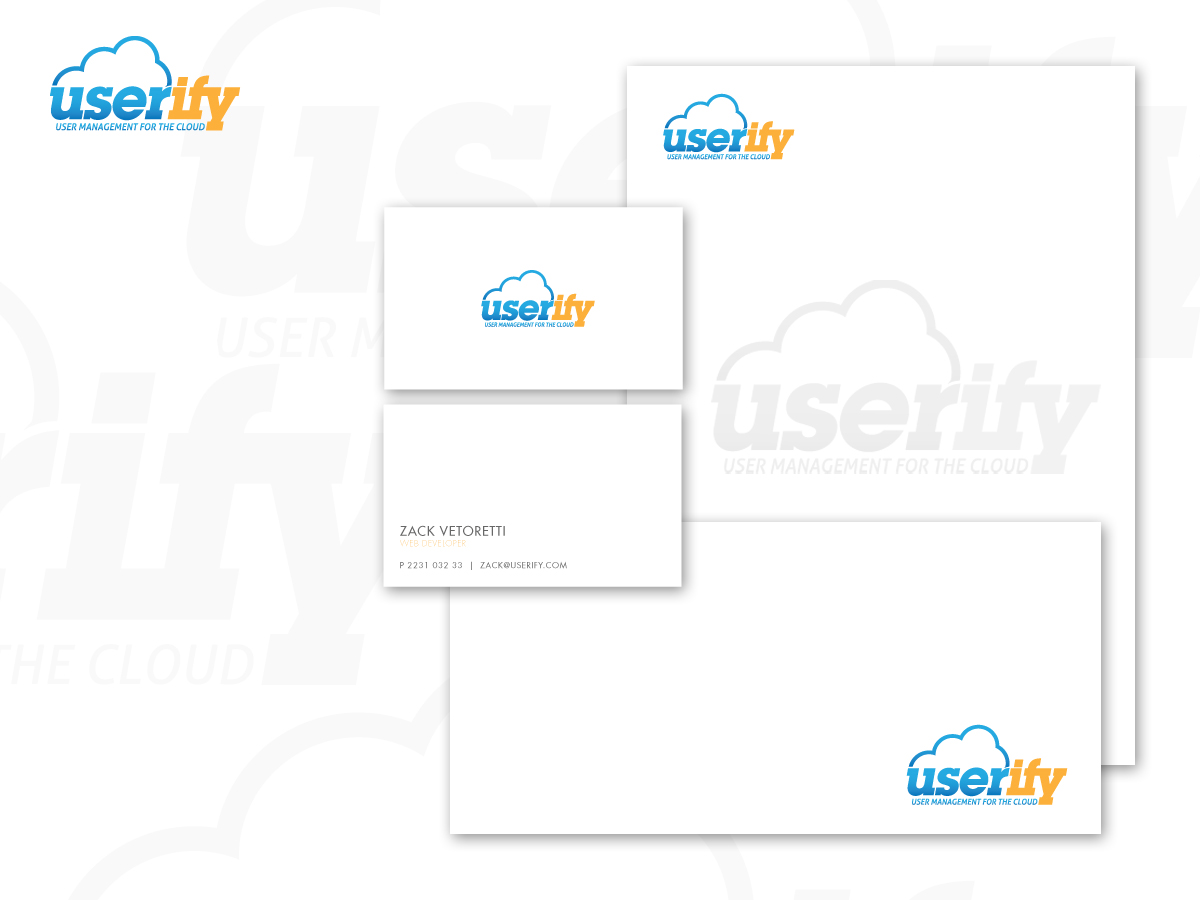
Logo for Userify (cloud user management)
¿Quieres ganar un trabajo como este?
Este cliente recibió 142 diseños de logo de 41 diseñadores. Eligieron este diseño de logo de Creative Juice como el diseño ganador.
Únete gratis Encuentra trabajos de diseño- Garantía
-
 US$460
-
 142 diseños
-
 41 diseñadores
Resumen de Diseño de Logo
Hi, I'm launching a startup called Userify, which provides user management for cloud users, an API, an innovative user interface, etc. Our customers are enterprises and cloud startups.
Looking for something clean and neat. Favorite colors are blues, greens, and orange but feel free to do something else. No tag line is needed, but if you want to add one, it should be "User Management for the Cloud" or something similar.
This is a FAST contest - two days - and I'm fully committed - already paid the money to DesignCrowd! This project also has a second place winner and also 3 participation awards. I ran a logo contest on 99 designs that got more than 800 entries and felt bad that I couldn't reward each of those fantastic designers, so I'll see how this works!
I promise to comment on and rate all the logos I like within 3 hours as long as I'm awake. ;) Also I will also eliminate logos as fast as possible so that we both don't waste too much time on a wild goose chase.
Please be creative! A few generalizations for things I like, but these are not rules - feel free to break these if you have a great concept!!
- cloud "web 2.0" logos
- keep gradients subtle
- logo should print well on many mediums (t-shirt, black and white, etc)
- probably not more than two colors and avoid excessive use of black
- keep colors light generally.
- most sans-serif fonts are more trendy, but slab fonts can be cool too
- if you''re stuck for ideas, feel free to incorporate a cloud or a user or both or none :)
- don''t make things too blocky, but a few angles in otherwise curvy logos can lend interest
- be creative and have fun and make the logo fun - but still professional
- The company name (Userify) should be part of the logo
Actualizaciones
Keep it simple please :)
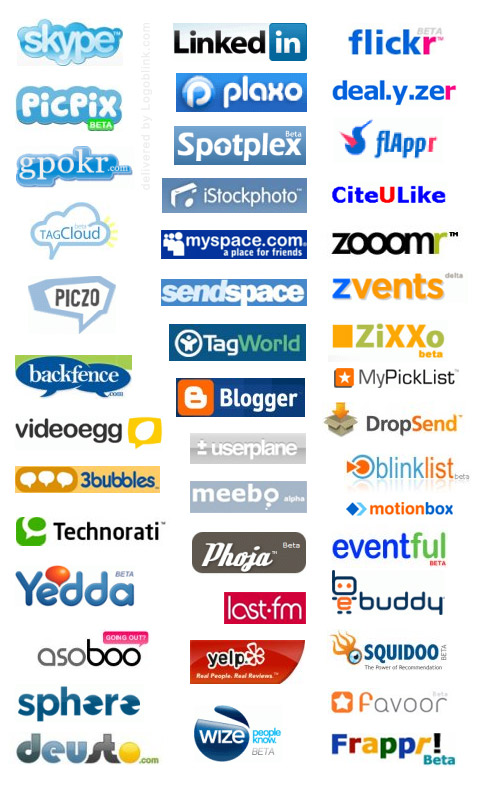
Cloud "web 2.0" logo ideas:
http://logoblink.com/wp-content/uploads/2008/03/logoblinkcom_web20-logos.jpg
http://cdn.3oneseven.com/wp-content/uploads/HLIC/web20logos.jpg
- keep gradients subtle
- logo should print well on many mediums (t-shirt, black and white, etc)
- probably not more than two colors and avoid excessive use of black
- keep colors light generally.
- most sans-serif fonts are more trendy, but slab fonts can be cool too
- if you''re stuck for ideas, feel free to incorporate a cloud or a user or both or none :)
- don''t make things too blocky, but a few angles in otherwise curvy logos can lend interest
- be creative and have fun and make the logo fun - but still professional
- The company name (Userify) should be part of the logo
Added Sunday, October 21, 2012
Wow... this is incredibly difficult. I thought that it was all wrapped up but then I got a bunch more submissions and they're incredibly awesome.
Please hold off on any more contest submissions unless you have something mind-bendingly awesome.. I've got to catch up on feedback and everything! I'm going to end the contest early because one of these is going to be a winner, and one is going to be a second place, and I wish I'd set up a third and fourth place to award instead of those participation prizes because there are at least that many seriously fantastic winners. In my opinion, though, you ladies and guys are all awesome and I wish you the very, very best in the future! Thank you for all of your submissions and I'll be making a final decision today!
Best regards,
Jamieson
Added Sunday, October 21, 2012
Amazing work!! If I didn't give you enough feedback, just ask!! Thanks again for participating and I'll launch another contest soon!
Added Sunday, October 21, 2012
Objetivo del mercado(s)
Enterprise and cloud startups
Tipo de industria / entidad
It Company
Texto del logo
Userify
Mira y siente
Cada control deslizante ilustra las características de la marca del cliente y el estilo que debe comunicar el diseño de tu logotipo.