"Warehouse Of London" is an online shop selling high-end vintage industrial furniture.
¿Quieres ganar un trabajo como este?
Este cliente recibió 34 diseños web de 5 diseñadores. Eligieron este diseño web de SemTolentino como el diseño ganador.
Únete gratis Encuentra trabajos de diseño- Garantía
-
 £225
£225
-
 34 diseños
-
 5 diseñadores
Resumen de Diseño Web
Business name:
Warehouse of London
Description of business:
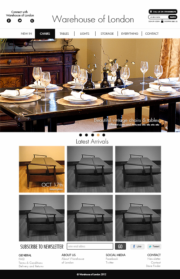
Warehouse Of London is an online shop selling high-end vintage industrial furniture. The stock we mainly deal in is anything from lights, chairs, tables ect. Most of what we sell are one off rare vintage items. What we offer is statement pieces often described as ‘Industrial furniture’.
Existing website/blog:
http://warehouseoflondon.com/
Page descriptions:
I would like the look and feel of the site to come across like a high-end fashion store; I don’t want it to come across as cheap. I would like people to feel that they are buying quality trendy items. It’s a niche market I’m aiming at but I hope them to visit the site because they know they are getting the best one off items.
Colours:
White background
Black font not too aggressive and heavy
Any navigation bars or lines should be in black or silver or grey
Very clean and crisp
Minimal and classy
Actualizaciones
Project Deadline Extended
Reason: I have extended the deadline as I have now made a comitment to pay the winning design.
When I started the project I was not sure how to set it up correctly and may have driven away designers
Added Saturday, November 03, 2012
I have altered the brief, I now want white background a clean crisp layout
Colours:
White background
Black font not too aggressive and heavy
Very clean and crisp
Minimal and classy
- Along the top:
-Name “Warehouse of London” Centred as written, Simple clean slim font
-Telephone number: Along the top wherever suits
The navigation bar:
-home//chairs//tables//lights//storage//everything//contact
-Twitter//facebook icons along the very subtle in a corner
-Shopping basket top right.
-“Join Mailing list” near twitter and facebook icons
Image slide show center page showing latest items.
- Need the original PSD files at the end.
Added Saturday, November 03, 2012
Objetivo del mercado(s)
Trendy people who have money to spend and want a quality one-off item of furniture.
-Home owners 25 onwards
-Trendy warehouse/pent house apartments
-Looking for quality quirky items
Tipo de industria / entidad
Industrial
Mira y siente
Cada control deslizante ilustra las características de la marca del cliente y el estilo que debe comunicar el diseño de tu logotipo.
Elegante
Atrevido
Juguetón
Serio
Tradicional
Moderno
Atractivo
Profesional
Femenino
Masculino
Vistoso
Conservador
Económico
De Alta Gama
Requisitos
Debes tener
- When designing this site: Think Minimal, classy clean and crisp.
White background
Black or silvers or greys as main bars and line.
Nice simple slim font, easy to read
The name centered with phone number near
Image slide show in the middle
Along the top:
-Name “Warehouse of London” Centred as written, Simple clean slim font
-Telephone number: Along the top wherever suits
The navigation bar:
-home//chairs//tables//lights//storage//everything//contact
-Twitter//facebook icons along the very subtle in a corner
-Shopping basket top right.
-“Join Mailing list” near twitter and facebook icons
Image slide show center page showing latest items.
Agradable de tener
- Need the original PSD files at the end.
Websites for inspiration:
http://www.topshop.com
http://www.net-a-porter.com
http://www.alexandermcqueen.co.uk/menswear/formal-wear/smart-trousers/ABCB,en_GB,sc.html
http://www.rarelondon.com/
http://www.scotch-soda.com/en/
This website is a close example of what I am currently thinking of. I like the image slideshow that I could use to show my latest items.
http://www.liberty.co.uk/
I really like this site, apart from the horrible wallpaper boarder. I think the Liberty logo is great and almost want to copy it slightly.
I like the general layout along the top.
These two website are stores that are selling similar items, I however don’t like their websites, its just a example of what field I am in.
http://www.theoldcinema.co.uk/
http://www.pigeonvintage.co.uk/
No debería tener
- Not Colorful
Not cheep
Not cheesy
No clutter