Logo Design Project for a health brand
¿Quieres ganar un trabajo como este?
Este cliente recibió 62 diseños de logo de 20 diseñadores. Eligieron este diseño de logo de sofyanhadi como el diseño ganador.
Únete gratis Encuentra trabajos de diseño- Garantía
-
 €200
€200
-
 62 diseños
-
 20 diseñadores
Resumen de Diseño de Logo
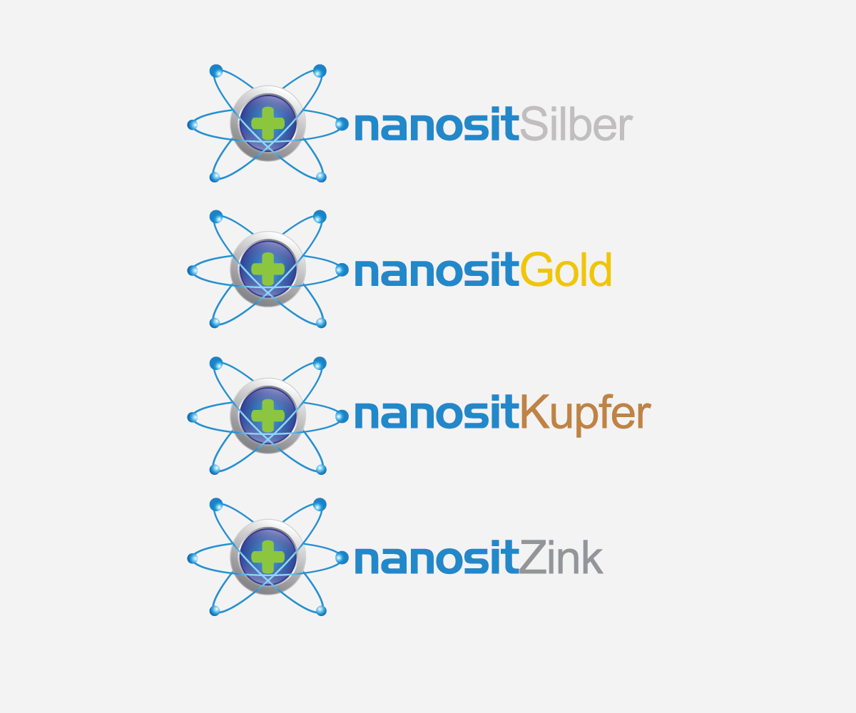
Nanosit is a brand for a set of 4 different colloids, namely colloidal silver, colloidal gold, colloidal zinc and colloidal copper. Such colloids have a very positive impact on people‘s health. A colloid is a substance microscopically dispersed evenly throughout another substance. In our case the substance is water and a metal which has been broken down by an electrochemical process to the smallest possible particle size (also called nano-particles).
There will be 4 variations of this logo, each representing the respective type of colloid.
The logo consists of 3 parts and:
1) A graphic part showing an atom or a cluster of atoms surrounded by energy or emitting energy. A sense of movement or a sense of transmitting energy should be created. This part should consist of maximum 3 colors and the drawings should be abstract.
2) The brand name nanosit using the attached Handle Gothic font in small caps.
3) The word Silber or Gold or Zink or Kupfer (representing the 4 different types of colloids) written in a smaller non-futuristic, non-serif, simple font, such as Arial, Verdana, Tahoma, Calibri or similar. The color of this word is in the color of the metal this particular logo represents, i.e. if the word is Silber, the color of the font is silver. This 3rd part is the only part that differentiates the 4 variations of the logo.
We need the logo in vector graphic and as a png. The logo's colors and size has to match up with this shop: http://www.provital-shop.com/
The maximum dimensions are: 280 x 70 pixels
Actualizaciones
Hello to everyone!
We appreciate the participation in our project and it has been an amazing experience. We had to make a decision among 60 or so designs. This was a very hard decision as there were so many excellent designs.
The creative power in your minds is incredible. Everyone is a winner, even though you may not have been awarded with the winning bid. You are a winner because of your creative power between your ears.
Thank you all again!
Added Tuesday, November 27, 2012
Objetivo del mercado(s)
b2b: pharmacies, doctors
Tipo de industria / entidad
Health
Texto del logo
nanosit silber
Estilos de logo de interés
Logo abstracto
Conceptual / simbólico (texto opcional)
Mira y siente
Cada control deslizante ilustra las características de la marca del cliente y el estilo que debe comunicar el diseño de tu logotipo.
Elegante
Atrevido
Juguetón
Serio
Tradicional
Moderno
Atractivo
Profesional
Femenino
Masculino
Vistoso
Conservador
Económico
De Alta Gama
Requisitos
Debes tener
- abstract, minimalistic, bright colors
No debería tener
- background color including white, frame, dark colors