Burst Webcomic
¿Quieres ganar un trabajo como este?
Este cliente recibió 29 diseños web de 4 diseñadores. Eligieron este diseño web de Creative Usha como el diseño ganador.
Únete gratis Encuentra trabajos de diseño- Garantía
-
 US$250
-
 29 diseños
-
 4 diseñadores
Resumen de Diseño Web
A simple signup landing page and blog design for an upcoming webcomic. I am mostly looking for a flat UI with a simple color scheme. I want to showcase a large background image and the comic title image. I have all the technicals figured out (I am a web developer by trade), so all I need now is a solid design I like.
The signup for should only have one field (email) and have text above it, and smaller text below it.
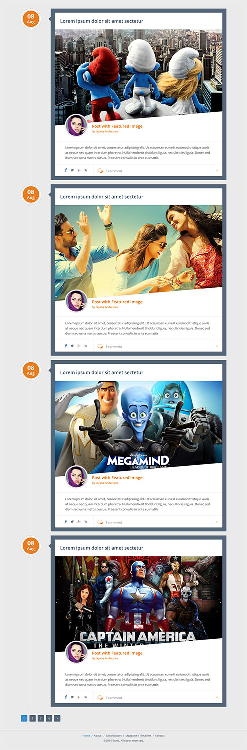
The blog, I am thinking, should be in the style of comic book pages. The home page would be blocks with large white outlines, with the article pages being an extension of that. As I stated before, should be fairly minimalist, but fun. Also, no sidebar or ads, IE single column. I have attached a simple mockup/layout of the blog to give a general idea of what I am going for.
I have attached the Logo and Background art (uncolored) for reference. Don't worry about the background image blending in, I can take care of that when the design is implemented. I will be focusing on layout and overall look, not necessarily readability (which I can fix).
~Please DO NOT take these examples literally. I will describe what I like about each example.~
Signup pages:
http://designmodo.com/landing-page-type-photo/
http://www.twelveskip.com/showcase/website-design/814/10-most-beautiful-landing-pages-in-minimalist-style
http://spyrestudios.com/47-modern-landing-pages-showcasing-inspirational-web-design/
Great examples of minimalist design. However, instead of text or other content, there should be a simple signup form, as described above. Also think a lot more "playful" rather than super professional.
Blog:
http://snopp.no/
Awesome example of a single column, minimal design. Needs to be more "comicbook style" though.
http://orderedlist.com/
Another good example of minimal design blog.
http://designshack.net/wp-content/uploads/res-blogs-5.jpg
I like the timeline feel here. Combine that with a comic book page kind of thing, and I think you have a winner.
Actual webcomic landing (not required):
http://www.girlgeniusonline.com/comic.php?date=20021104#.U90ysYBdUvU
I like the navigation. It makes the atmosphere nice for the comic. The page layout itself is WAY too busy.
http://www.penny-arcade.com/comic/
Fairly common webcomic, but their navigation and page layout is nice.
http://xkcd.com/936/
Another common webcomic. The simple page layout makes it easy for people to get started I think.
So there you have it. I will try my best to keep updating and adding to the description. If you have any questions, please don't hesitate to ask.
Actualizaciones
Hey Guys,
I am really appreciating all the effort you have been putting in. I am amazed to see all the awesome designs and all the care taken with the project. I am just writing everyone to let you know that I have uploaded a simple layout/wireframe of the blog, to give an idea of what I am going for. Can't wait to see how things progress, and good luck to everyone!
Added Thursday, August 07, 2014
Tipo de industria / entidad
Trade
Estilos de fuente para usar
Mira y siente
Cada control deslizante ilustra las características de la marca del cliente y el estilo que debe comunicar el diseño de tu logotipo.
Elegante
Atrevido
Juguetón
Serio
Tradicional
Moderno
Atractivo
Profesional
Femenino
Masculino
Vistoso
Conservador
Económico
De Alta Gama
Requisitos
Debes tener
- Must showcase a large background image (does not have to cover the entire background). Should be a flat UI as well. Should be mostly neutral with splashes of blue or purple. Social links should also be somewhere (twitter, facebook, etc.).
Agradable de tener
- I am thinking something with rounded boxes, but I can live without them. A more "fun" design as opposed to more professional is definitely nice to have.
If you would like to try a stab at the actual comic page display and navigation, you are welcome to submit something. It should not be a main priority though.
Being responsive is not a requirement, but it would be nice to have.
No debería tener
- A billion links in the navigation or look too busy.
No sidebar or advertisements. Should be a clean design.