Academic bored with usual scientific poster design needs poster for conference
¿Quieres ganar un trabajo como este?
Este cliente recibió 6 diseños de póster de 2 diseñadores. Eligieron este diseño de póster de Pinky como el diseño ganador.
Únete gratis Encuentra trabajos de diseño-
 A$130
A$130
-
 6 diseños
-
 2 diseñadores
Resumen de Diseño de Póster
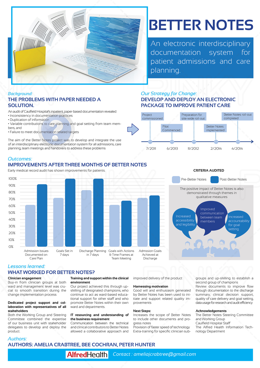
I need a poster to display the background, aims, process, outcome, next steps and lessons learnt related to the implementation of an electronic documentation project called Better Notes. The project involved the replacement of paper based medical record with electronic. The size of the final product needs to be A0 in a portrait orientation. Please see outline of poster content attached. Some of the content is yet to be finalised (as noted in attachment). The successful transition from paper to electronic system is what we want to convey. The logo of the hospital (to be provided) is red so it may be helpful as a starting point for colours. Although the duration is five day i will need to finalise the work on the 25th August for printing and delivery to conference organisers.
Actualizaciones
Project Deadline Extended
Added Thursday, August 14, 2014
Please note that further attachments have been added - an excel file containing the outcome graph and further explanation in the content docx
Added Monday, August 18, 2014
Objetivo del mercado(s)
The target market is a groups of academics with an interest in improved patient care through innovative solutions. It is for display at a conference with a focus on innovation, patient centred care, ...called APAC forum 2014 if you want to google it.
Tipo de industria / entidad
Electronic
Estilos de fuente para usar
Requisitos
Debes tener
- The title must be as written in the supporting document -(but it does not have to have to word "title" in front)
The authors and contact also need to appear, but do not need to be very prominent
The organisation logo has to appear - now attached
I will supply graphs for the results section, the results are still being finalised.
Agradable de tener
- I would like to display as much of the information as graphically as possible, although there still has to be written content given the nature of the project.
A prime example is the method section - this is wordy and bulky in a table at the moment, but I would like to represent this as a timeline graphically somehow, showing the work that has been done over the last three years.
No debería tener
- Too much dark background that makes it difficult to read.
_brief140840.jpg?AWSAccessKeyId=ASIARQT47ZIUQEQWYFWL&Expires=1784767598&response-content-disposition=attachment%3Bfilename%3D%22ALFH_RGB%20%28600dpi%29%20Thursday%2C%2014%20August%202014%2012_08_40.jpg%22&x-amz-security-token=IQoJb3JpZ2luX2VjEAAaCXVzLWVhc3QtMSJIMEYCIQDLQFGG3KTv%2FGbDm0S4QcXzAjmc3kP5r7nCSCxAlY2v7AIhAI69gy7W4p4c9WVqcefz6QX3E05N%2FwfrmVR7sLdjISlgKvQDCMn%2F%2F%2F%2F%2F%2F%2F%2F%2F%2FwEQABoMMTA0NDE1MDg3MTQ1IgxMZ2iEb7%2FmSgwUIo0qyAM1v879rUmAeT53H43SOAlAhfJ9MxnC%2FUOJnB93fw4G%2BIPxIhEjKIzZ%2BdnEII9nfrQO1hHwparHDy0T1lhsAp%2FbBDzqYXAnebnqCJUjqJbEfi1YYKHLLWpVt%2FvSRKzboB%2BARh2Cm5RxFa9l3tIwqFi5%2BpbCgzhZjZZ5lFnVJTUYqol59GHwJDs4iWfZV5LU0F1ZU8bz%2BX7lqASlyqWMV%2FF8nIQc7tgbsmabs1JVoQh6o7FuwyiukK%2FnBKExayThepcsTGiHtjOY3paMIfBOas3ij9oApjY5o9GwwENZ6kwUz89skRrAKQkdgAgTDuRhC76SJ5T3F6aawSZaUZoal3rcy%2B%2BiZiBOCwL2QyS%2B1ftY2tSDGfAuziWrAcplk%2FMwgg2ZqcEnAUdHelpDImz0nUyuEvNKOeyrj8VgcFhWC6T8D8WPqA6B1n3MyV7TtVLAJ2epCXeDO6CwV15NOh%2FZZft%2BxHEBI%2FAxsr%2BPfBVDkzgzpxPvj9Su5IXCIjLoh0mS4X4eWyqL8hW57vjyd7wGaKAF2a8PIqnvkepuFwAQkAbTHoftVbi1LwwI1OhJg3wm3glaZIHi2HlraNkiVKvsKwS56hsWr4ABCLsw4YSA0wY6pAFFFb48CbWeSwEElfJLAVLo0g5N66G%2BcK2Y6prmWw7An2GIMBv7zWiKX%2FfnKaBDW8MKBcKrPRsdEhf4mqPEFB0pG%2B1TqF0ROjNMcBBYv%2FERgpQzLmtQ3pw7rpH%2FLjTDtSQQfcCkvIE2839naJMqQw4nINOccbbs%2FFblfqRgiU6REuBgyjMDGy9%2BOOpD%2Bttx3DNYE473mIb3WfnhFY%2FZ7d0IwcmJoA%3D%3D&Signature=etOfq2Ij9Z9mx3DcyXBiVvc1WXQ%3D)