

 Refresh
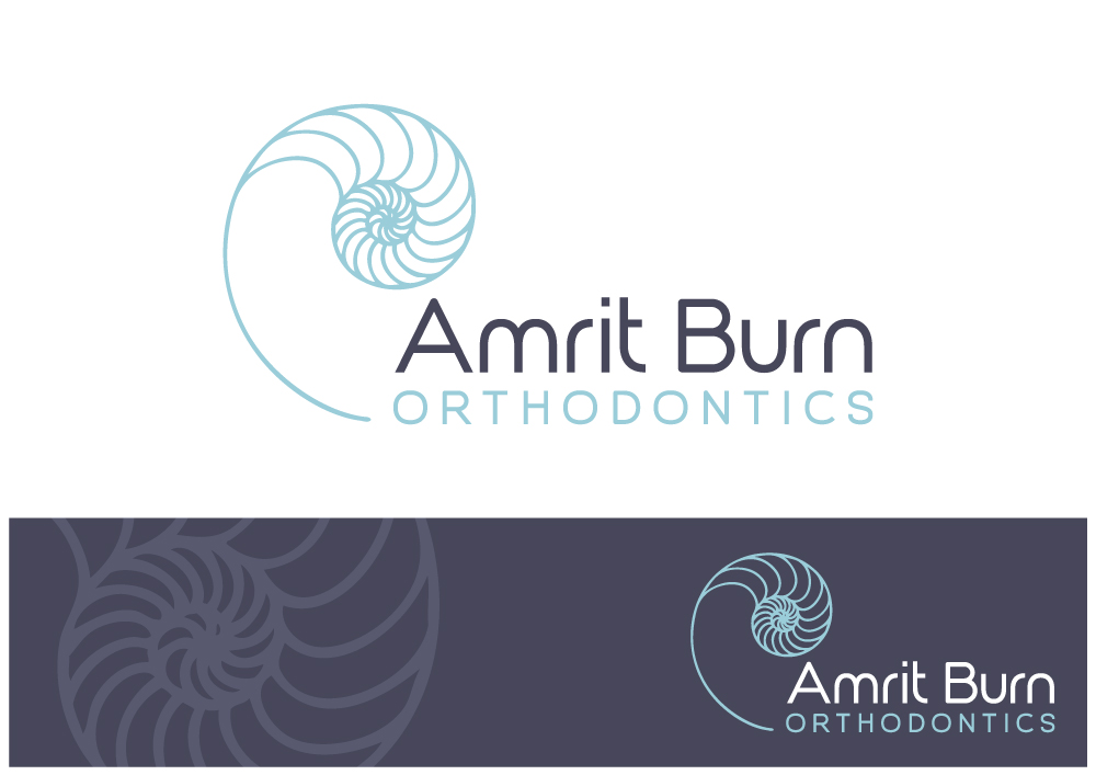
chambered nautilus - for orthodontist
¿Quieres ganar un trabajo como este?
Este cliente recibió 80 diseños de logo de 30 diseñadores. Eligieron este diseño de logo de Nigel B como el diseño ganador.
Únete gratis Encuentra trabajos de diseño
- Garantía
-
 US$470
-
 80 diseños
-
 30 diseñadores
Resumen de Diseño de Logo
I would like to revisit my existing logo design for my orthodontic practice - Amrit Burn Orthodontics. Its a small, boutique-type private practice in Seattle, WA. The nautical/marine theme has always spoken to me - our office has a gorgeous salt water fish tank and we have used the attached logo (brown shell with scripty name) for about 5 years. There are decorative metallic angel fish on the wall and other nautical theme items in the office.
Lately, I have toyed around with changing the color of the shell to a teal color (see other file) and also I have made the name of our practice way easier to read. I like the combination of teal as the primary color on a white background with black text, but am open to your color interpretations on this project. The new font I played with is a little generic, don't you think? (century gothic). I would like our new logo to go well with common sans serif word processing fonts - as this logo will very often appear at the top of a letterhead.
What I would like to see is a redesign of the logo that takes these elements and makes them pop - something clean and elegant. We are projecting the image of a higher end orthodontic provider who focuses on quality and a superior patient experience. I like the chambered nautilus for its natural perfection, the golden proportions of the spiral mathematically. Subconsciously I would like to say that a potential client (patient) should expect to enhance their (or their child's) own natural beauty when they choose my practice. Orthodontic treatment puts the teeth and jaws into a more beautiful and naturally determined order, much like the natural order one observes with a chambered nautilus shell.
The target client is most often an adult female, typically a mom. She is seeking a trusted and quality provider for this service, usually for herself, her kids, or a man in her life. So it should appeal to a feminine audience BUT not be inaccessible to an adult male either. We have a growing number of those seeking treatment as well. The local demographic is tech/medical savvy and well educated. Its an urban location, with many competitors. Overall, the city has a nautical/marine/mountains/trees vibe.
Another important target audience is our referring dental offices. These dentists are 50/50 male/female, and are looking for a quality reputable orthodontist to refer their patients to. This referral relationship is the backbone of my business, as at least 1/2 of our patients are referred by a dentist. (The other 1/2 finds us online) The referring dentists' staffs are 99% female, and they are often our point of contact with correspondence, etc.
My first name (Amrit) is not obviously female - often people assume I am a male doctor before they meet me. Perhaps I have used the shell to give a more feminine hint as to the identity.
Also - probably something you designers already know: In a lot of lower case fonts, the "r" and "n" of my last name run together and look like a "m"
Which is unfortunate because it appears as Bum, instead of Burn. Please try to minimize this issue!
Last, I would like to see a design that would emboss well - I would like to use an embossed (colorless?) version of the logo to put on the front of a white pocketed folder with some printed material to give to the patient after their initial consultation.
Objetivo del mercado(s)
The target client is most often an adult female, typically a mom. She is seeking a trusted and quality provider for this service, usually for herself, her kids, or a man in her life. So it should appeal to a feminine audience BUT not be inaccessible to an adult male either. We have a growing number of those seeking treatment as well. The local demographic is tech/medical savvy and well educated. Its an urban location, with many competitors. Overall, the city has a nautical/marine/mountains/trees vibe.
Another important target audience is our referring dental offices. These dentists are 50/50 male/female, and are looking for a quality reputable orthodontist to refer their patients to. This referral relationship is the backbone of my business, as at least 1/2 of our patients are referred by a dentist. (The other 1/2 finds us online) The referring dentists' staffs are 99% female, and they are often our point of contact with correspondence, etc.
Tipo de industria / entidad
Nautical
Texto del logo
Amrit Burn Orthodontics
Estilos de logo de interés
Logo abstracto
Conceptual / simbólico (texto opcional)



Estilos de fuente para usar

Colores
Diseñador para elegir los colores que se utilizarán en el diseño.
Mira y siente
Cada control deslizante ilustra las características de la marca del cliente y el estilo que debe comunicar el diseño de tu logotipo.