

 Refresh
Logo Design for Coaching/Training Business
¿Quieres ganar un trabajo como este?
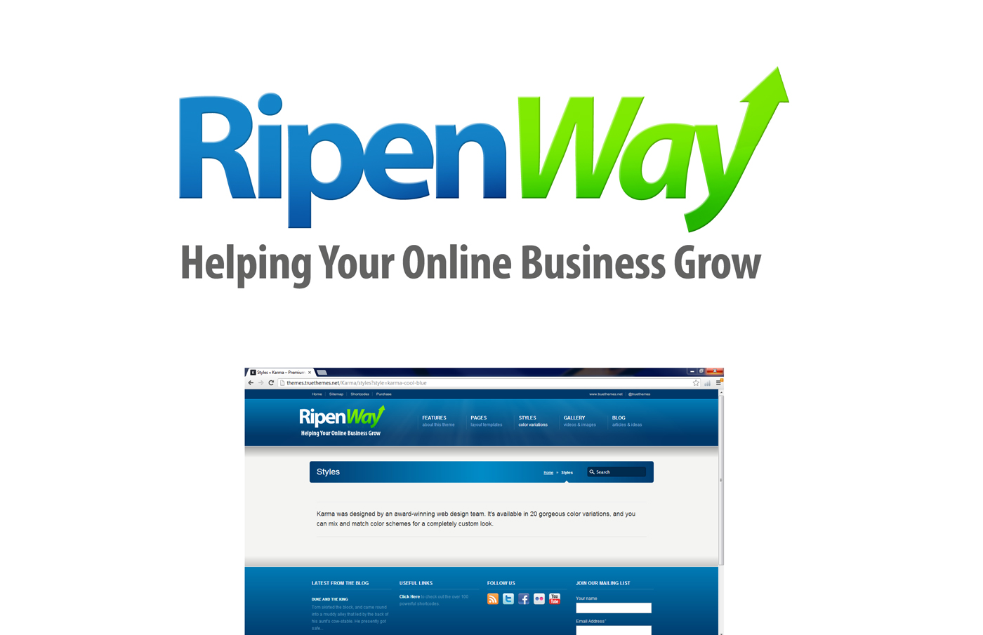
Este cliente recibió 119 diseños de logo de 29 diseñadores. Eligieron este diseño de logo de Jason Vantran como el diseño ganador.
Únete gratis Encuentra trabajos de diseño
- Garantía
-
 US$320
-
 119 diseños
-
 29 diseñadores
Resumen de Diseño de Logo
I need a logo designed for my new coaching/training/public speaking business based in Denver, CO called 'RipenWay'. The word 'ripen' is a reference to the concept of growing something (think fruit ripening like an apple going from green to red).
I've launched several of my own web companies and sold one in 2008. Now I help other people save time and money by avoiding some of the painful mistakes I made. I'm also in the process of publishing a book that will be available in the next few weeks called 'The Web Startup Roadmap: Navigate Your Way to a Successful Online Business.'
My tagline is 'Helping your online business grow.' I'd like this to be incorporated into the logo, either above or below it.
To help explain the name a little more, my slogan is 'Don't do it the hard way. Do it the RipenWay.'
I'd like the design to use blue as the primary color (not too bright and not too pastel...something mid-range). I'd like to use a complimentary green as the secondary color.
Some people have suggested I use an apple or abstract representation of fruit for the mark to convey the concept of ripening. I'm neither for nor against it so don't feel like it has to have that. My only request is that it looks professional and not cheesy.
Please design it to fit in a website header, so the shape needs to be rectangular instead of square.
This is a business coaching service so keep it clean and simple. A lot of life coaches have cursive fonts but that's not the message I'm trying to send. I'm looking for a simple, clean font and design. It also needs to print well, and look ok in black and white.
I'm happy to answer questions if you have any. Thanks a bunch!

Actualizaciones
Please don't use orange. It's my least favorite color. Please stick to blue, green and/or black/gray.
Added Tuesday, December 04, 2012
I like the logos for Mint.com, Groupon, PayPal, LinkedIn, Dropbox, Evernote and other similar designs. Simple and clean but still interesting and memorable.
Added Tuesday, December 04, 2012
Objetivo del mercado(s)
People who are 30+ years old and want to start an online business but don't know how.
Tipo de industria / entidad
Business
Texto del logo
RipenWay - Helping Your Online Business Grow
Mira y siente
Cada control deslizante ilustra las características de la marca del cliente y el estilo que debe comunicar el diseño de tu logotipo.