Fantasy Hockey Team Needs Logo Update
¿Quieres ganar un trabajo como este?
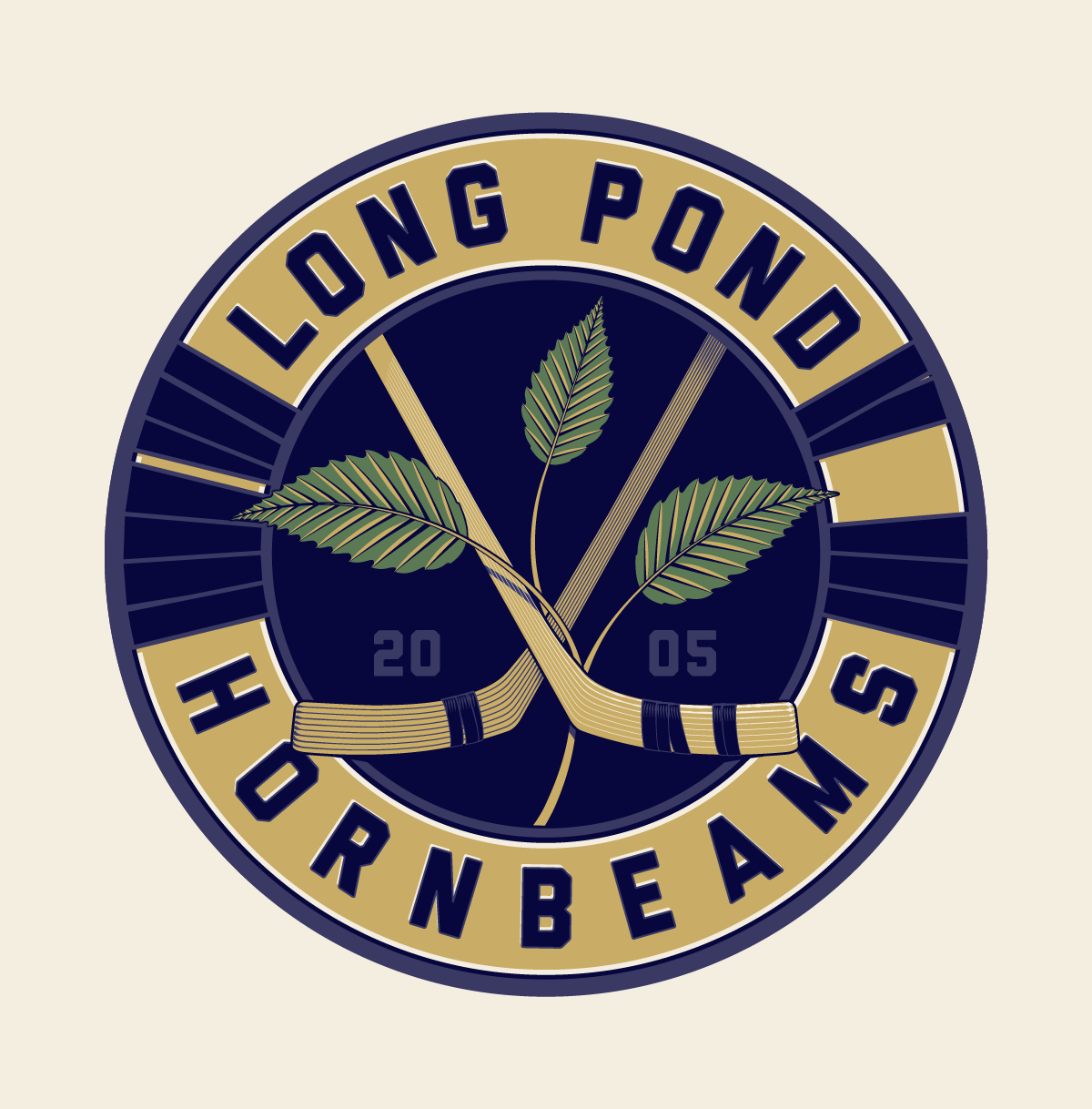
Este cliente recibió 29 diseños de logo de 6 diseñadores. Eligieron este diseño de logo de CreoErgoSum como el diseño ganador.
Únete gratis Encuentra trabajos de diseño- Garantía
-
 C$310
C$310
-
 29 diseños
-
 6 diseñadores
Resumen de Diseño de Logo
The Long Pond Hornbeams are a founding member of the Firewagon Hockey League (FHL). The FHL is entering its 10th year, and the Hornbeams have had considerable success, winning 2 championships and tying for a third. We are looking to update the teams image.
Long Pond is in Windsor, Nova Scotia, Canada and considered to be the birthplace of hockey. References to Long Pond are found in the writings of Thomas Chandler Haliburton.
When hockey was first played, one-piece sticks were fashioned from hornbeam trees (also called ironwood trees) growing on hillsides. They were suitable because of the strength of the wood, and the angled root or base was perfect for a blade.
Our current logo shows hockey sticks notionally coming from a tree, meant to be a hornbeam tree.
The colors have been navy blue and sand yellow, but i think its time to introduce another accent color. [note: the current logo attached is too dark, almost black - it should be navy blue]
The logo should include the words Long Pond Hornbeams. Optional wording would be est. 2005
Google "hornbeam leaf" to see the distinctive shape of the hornbeam leaf and its jagged edges
Google "european hornbeam tree" to see the proper shape of a hornbeam tree
Go to http://www.birthplaceofhockey.com/ for more information about Long Pond and the history of hockey in Windsor, Nova Scotia, Canada.
The logo should tend towards the traditional rather than modern. See the attached picture for the Starr skate company in Nova Scotia in the early days of hockey for a feel.
See also the picture attached of an old one-piece hockey stick. Notice the grain of wood following the blade and shaft of the stick. Notice also that old sticks had a different look and shape than hockey sticks of today. We would like to capture the old rather than the new.
We considered the idea of having three trees (one being smaller than the other two) representing the two championships and one tie. Its an idea we like, but it would depend on how its presented. It is not a requirement.
See the fonts we are aiming for in the attached file showing the words LONG POND HORNBEAMS in Gin, Bourbon, Prohibition and Abolition font. I am NOT asking you to buy a font - I just want to show you fonts we like - edgy, vertical, strong and readable.
Actualizaciones
As a companion to the updated logo, please present the word marks HORNBEAM HOCKEY and HORNBEAM ALERT! in the same font.
We would use HORNBEAM HOCKEY on a t-shirt with the logo.
Whenever there is important news about the team, we send out a HORNBEAM ALERT!
Added Wednesday, August 27, 2014
Regarding colors, one idea we have is to add a second tone of blue and a second tone of sand/brown.
Added Wednesday, August 27, 2014
For inspiration, I found a new hockey logo that meshes some elements of the current Hornbeam logo and has 2 shades of green and 2 shades of grey. The Cedar Rapids Roughriders just released this logo for the coming season.
I really like the font they use. One criticism I would have of the current Hornbeam logo is the font - its a bit cheap western. For other fonts I like, see Gin, Bourbon and Prohibition on myfonts.com
Added Wednesday, August 27, 2014
Project Deadline Extended
Reason: We just increased the budget and guaranteed payments, so we extended the deadline by 4 days so that everyone has 10 days left to make submissions. Thank you to everyone that has made submissions so far. We are well on the way to an awesome updated logo.
Added Sunday, August 31, 2014
I have been asked about fonts. I am posting samples of fonts that I am hoping to see.
Added Friday, September 05, 2014
I am NOT asking you to buy a font - I just want to show you fonts we like - edgy, vertical, strong and readable.
Please read the brief and for inspiration as to elements we are looking for.
Added Friday, September 05, 2014
Project Deadline Extended
Reason: We are extending the deadline by one day.
We are trying to accommodate some recent submissions, and we have added a second place prize of $100.
Added Wednesday, September 10, 2014
Objetivo del mercado(s)
Sports fans
Tipo de industria / entidad
It Company
Texto del logo
Long Pond Hornbeams
Estilos de logo de interés
Logo con emblema
Logo contenido dentro una forma / figura
Logo pictórico / combinado
Un objeto del mundo real (texto opcional)
Mira y siente
Cada control deslizante ilustra las características de la marca del cliente y el estilo que debe comunicar el diseño de tu logotipo.
Elegante
Atrevido
Juguetón
Serio
Tradicional
Moderno
Atractivo
Profesional
Femenino
Masculino
Vistoso
Conservador
Económico
De Alta Gama
Requisitos
Debes tener
- words LONG POND HORNBEAMS
an icon of some kind
colors navy blue, sand yellow
Agradable de tener
- another accent color
No debería tener
- a mascot, or anything aimed at young children