Hospital Website Design - PSD only
¿Quieres ganar un trabajo como este?
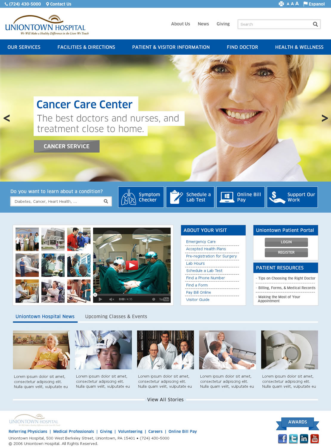
Este cliente recibió 155 diseños web de 27 diseñadores. Eligieron este diseño web de DesignCreativity4you como el diseño ganador.
Únete gratis Encuentra trabajos de diseño- Garantía
-
 US$410
-
 155 diseños
-
 27 diseñadores
Resumen de Diseño Web
We need a web design for a community hospital based in Uniontown, Pennsylvania.
We would like to see a first round of designs for the website HOMEPAGE. Once we have selected finalists for the look & feel, based on the submitted homepage designs, we will request an additional INTERNAL page design.
Both designs should follow the content requirements displayed on the attached wireframes. I will post the internal page wireframe after the homepage design finalists are selected.
The desired Look & Feel for the website is clean and modern.
3 sites we like are:
http://www.abingtonhealth.org/
http://www.lvhn.org/
http://www.scripps.org/
Attached are the Homepage wireframe, and the Uniontown Hospital Logo.
The winning design will communicate a bright, healthy, energetic, community-oriented feeling.
Please note that readability is very important for a hospital website. Font-sizes and line-heights should be carefully selected for comfortable reading.
Actualizaciones
Dear designers --
Please don't feel locked into the exact shades of blue / brown used in the logo. We find this color scheme quite ugly and are working on a logo update. The new color scheme will probably still involve some shades of blue and brown, but we aren't sure yet. Please use your best judgement to make a beautiful design, similar in style to the modern / simple aesthetic of http://www.abingtonhealth.org/
We will be working on feedback to designs today. Thank you.
Added Monday, September 08, 2014
Regarding Large Rotating Graphic area and Navigation:
We prefer a full-width display, rather than boxed. The navigation should be visually prominent, easy to read text that one can scan easily across the top of the page.
Again, please refer to http://www.abingtonhealth.org/ for our preferred design aesthetic. Some of the designs submitted have been somewhat dated in their styling. We'd like a polished, modern, crisp, bold, beautiful design.
Added Monday, September 08, 2014
Re: choice of image in large rotating graphic area --
Designers, please do not use stock photography of a group of doctors, or a nursing home scene, in your sample rotating graphic areas. Although this should not affect our perception of the design, it throws off everything in the page if we don't like the image. Please try to select a bold / attractive image that you would like to set the tone for your design.
Added Monday, September 08, 2014
Project Deadline Extended
Reason: Extending our deadline to receive more designs exploring other color options containing less brown, or browns with a more attractive vibe.
We would also like to see designs that are not exact replicas of the wireframe. The wireframe is just to show the elements on the page. Please use your creativity to utilize these elements in an attractive layout that we will like.
We would also prefer to see use of photography that shows a younger, more cheerful, hopeful feeling in the design... and where the photographs are consistent with your design approach.
Thanks!
Added Thursday, September 11, 2014
In general, feedback for everyone is, please look here: http://www.abingtonhealth.org/
that's the feeling / vibe we want.
DO NOT let the old, ugly, outdated logo determine your design. We are having the logo redesigned.
DO NOT take an ugly, outdated template, and adapt it for this website.
We want to see something BEAUTIFUL!!!
Please give us your best effort! People who come to this website are in health crisis, and they want to be uplifted!! Their good spirits are in your hands.
Added Thursday, September 11, 2014
Project Deadline Extended
Reason: We are still reviewing submissions and working with designers to provide better feedback. Thanks for your patience.
Added Saturday, September 20, 2014
Project Deadline Extended
Reason: our sincerest apologies for the failure to provide adequate feedback this week. We hit a snag with the various decision makers on this project and were not able to review the recent submissions. We will make every effort to have a decision by tomorrow. Thank you for your patience.
Added Thursday, September 25, 2014
Objetivo del mercado(s)
Adults based in suburban & rural community, aged 18-80.
Tipo de industria / entidad
Hospital
Mira y siente
Cada control deslizante ilustra las características de la marca del cliente y el estilo que debe comunicar el diseño de tu logotipo.
Elegante
Atrevido
Juguetón
Serio
Tradicional
Moderno
Atractivo
Profesional
Femenino
Masculino
Vistoso
Conservador
Económico
De Alta Gama
Requisitos
Debes tener
- The design must include all of the content areas outlined on the attached wireframe.
The design must include the attached logo. (Note, we may update the logo during the design contest, but it will not be changed dramatically. It will just be modernized slightly.)
Agradable de tener
- Show hover states for things like Navigation, Links, or small images in gallery, so we can see how you imagine interactive states.
_brief025936.jpg?AWSAccessKeyId=ASIARQT47ZIUU74NFOFL&Expires=1764300732&response-content-disposition=attachment%3Bfilename%3D%22logo%20%281%29%20Tuesday%2C%2002%20September%202014%2016_59_37.jpg%22&x-amz-security-token=IQoJb3JpZ2luX2VjEMz%2F%2F%2F%2F%2F%2F%2F%2F%2F%2FwEaCXVzLWVhc3QtMSJIMEYCIQDDIeOnbWHmX2KP1F%2B%2B8E5OHjdIclcCKDL4LdhLvZWckAIhAI%2FzQdiixkx9ti833VfWjshFU2KaH4zSCdd%2BQqgoyg1SKvQDCJT%2F%2F%2F%2F%2F%2F%2F%2F%2F%2FwEQABoMMTA0NDE1MDg3MTQ1IgzcOiSfRlguWTx7C5cqyAN6lPamVLrZAF%2Flx6LKM8WNSX0L2nvaX%2Bf8LPTn4LyyZOeWt2kAdKU3qdDQrIdcl9RoL2EjvEhJM0Tnk2CM8Fx2GJuv0GLZC%2FJ%2FVY%2BS%2FO2QWlyGbn4LDAnkjEudqj3%2BkkF47ZGq8ifCBsmxXYZ4RPBb3Njp6SimOzjnWQChSLsVIUqguDDszgqWZ792HahJVjPD%2FpNiDUsXofU4ftf4vZNuOMV1qTZ%2BB22aTYIm4I8HtCEillzrxCowOzLg1EuUa%2BDn0MVj2Op5ktvxtwvgixkf2Fh2bamZ6JzHjUsBJ6cH1GBXCxQG6GzG%2FDoFiPw9V0sNBNcTJfOBld8pWCvioIK8d9Sm%2F9fWxp%2BK5Y3j5mXexjgkhIbCToHryubVWVC7BJuX9qobG2HCbSXzTO1PZNANGjifm2CaFxBN5gHCDAV4pHieufVltSZEITy5OtAVBCOCIbS0bOCpKBjr3oi2cTKAzGQ4JIO0IGbUnC4w8V%2BOQRiB3QSUemlF58Y0xghTI7Ss%2FMTxELOWNmvcO6GiR8UDynbV5nvTdBrJ1fK9U%2B%2Ft04cy3ZrWoU6dKVIL8FDvmbDZWJ0HAo%2Bl0FgZ85z6i%2FkVWpY5dboLf7kwpoKfyQY6pAG0OL0%2B9NTroozUC4xCCgfFceYt9Sqat3RYp%2Fe29kDNAmk69SOCZPYANf34TXN%2B3viY8JHhY4ZwlMZN8jum222J2FAgDU2oliFnzUE7IqHTSKR%2BHEeEzODorlxb8SQImvLslIPe6sSk%2F6zVIEsKp61fGhkDojPxNu2P5ERfi7rXoMnci6PjVKhR%2BsB4YU3lQxacPNit%2F%2BtHM8KtyumDdMMnIX38QA%3D%3D&Signature=%2BxfugrZ8KRjLCtPPYQMv2meAv7A%3D)