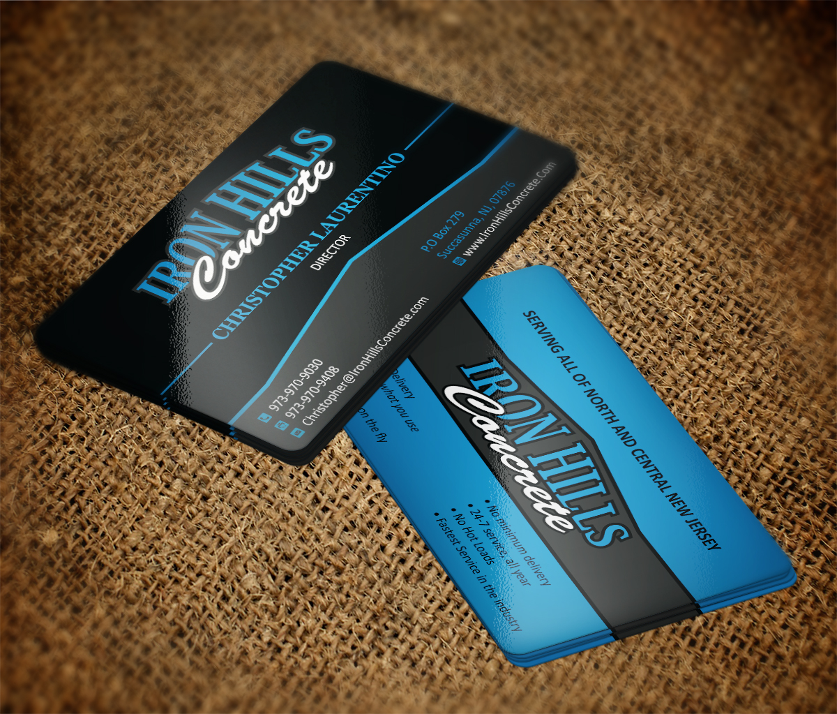
Iron Hills Concrete business card design
¿Quieres ganar un trabajo como este?
Este cliente recibió 136 diseños de tarjeta de presentación de 13 diseñadores. Eligieron este diseño de tarjeta de presentación de MT como el diseño ganador.
Únete gratis Encuentra trabajos de diseño- Garantía
-
 US$80
US$80
-
 136 diseños
-
 13 diseñadores
Resumen de Diseño de Tarjeta de Presentación
We need a business card developed for a local ready mix concrete company. We want a 2 sided design
The front just needs the basic contact info:
Christopher Laurentino
P.973-970-9030
F. 973-970-9408
www.IronHillsConcrete.Com
Christopher@IronHillsConcrete.com
P.O Box 279
Succasunna, NJ, 07876
Service All of North And Central New Jersey With Ready Mix Concrete
The back will have a simple bullet point list:
• Metered Delivery - Use only what you pay for
• No Waste
• Multiple slumps on the fly
• No minimum delivery
• 24-7 service, all year
• No Hot Loads
• Fastest Service in the industry
Actualizaciones
I like the submissions using the existing colors. I think blue might also be a color to use as well. For the next trucks we order we will probably paint them blue. Colbalt blue
Added Thursday, September 04, 2014
I must have made a typo:
It should read, Serving all of North and Central New Jersey.
It should also say:
Pay for only what you use.
Added Friday, September 12, 2014
Objetivo del mercado(s)
We will be targeting the construction industry
Tipo de industria / entidad
Concrete
Estilos de fuente para usar
Colores
Colores seleccionados por el cliente para ser utilizados en el diseño del logotipo:
Mira y siente
Cada control deslizante ilustra las características de la marca del cliente y el estilo que debe comunicar el diseño de tu logotipo.
Elegante
Atrevido
Juguetón
Serio
Tradicional
Moderno
Atractivo
Profesional
Femenino
Masculino
Vistoso
Conservador
Económico
De Alta Gama
Requisitos
Debes tener
- It needs to have a clean uncluttered look. The back is dedicated to telling customer what we do. Our advantage is we use a truck that delivers concrete with several advantages over barrel trucks, hence, why the back bullet points are important
Agradable de tener
- Our logo. I think since our logo is green, the front might look good with some red, like a red background (also the color of our truck)
No debería tener
- clip art.