WILL PAY MORE 4 QUALITY WORK GUARANTIED: Classy but sexy - dating services logo
¿Quieres ganar un trabajo como este?
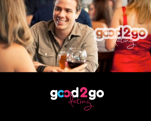
Este cliente recibió 204 diseños de logo de 109 diseñadores. Eligieron este diseño de logo de JTdsign como el diseño ganador.
Únete gratis Encuentra trabajos de diseño- Garantía
-
 US$200
-
 204 diseños
-
 109 diseñadores
Resumen de Diseño de Logo
I am a solo female entrepreneur and I need a logo for a start-up company called "Good-2-Go Dating". Our service - pre-planned, organized romantic dates. We work with both singles and couples. Besides planning a perfect night-out we also specialize in matchmaking.
Adjectives to describe our image/brand: classy, high-end, quality, solid, lasting, personalized.
Adjectives to describe our logo: simple, clever, catchy, original but playful. Black/white/red or pink colours.
I'm willing to pay more for quality work. If I pick your logo, I would also like to have you design my web-site and my business cards. Ideally I would love to build a lasting, long-term business relationship with my designer that would benefit both parties :)
Please email: lananikon@gmail.com if you have any questions about my project.
Actualizaciones
Things to keep in mind:
- the roundness of the letters in "good" and "go". play with it and see if you can tie those letters together and create "flow"
- I think i like having the word "dating" in a different style than the rest
I'll tell you why I'm concentrating on the cohesiveness of the logo. I plan on having a very multimedia website. I want for my logo to "unveil". I don't want to display it all at once. I want to have a clever way to have it appear on the home page.
Added Saturday, December 08, 2012
Tipo de industria / entidad
Dating
Texto del logo
Good-2-Go Dating
Mira y siente
Cada control deslizante ilustra las características de la marca del cliente y el estilo que debe comunicar el diseño de tu logotipo.
Elegante
Atrevido
Juguetón
Serio
Tradicional
Moderno
Atractivo
Profesional
Femenino
Masculino
Vistoso
Conservador
Económico
De Alta Gama
Requisitos
Debes tener
- Things to keep in mind:
- the roundness of the letters in "good" and "go" play with it and see if you can tie those letters together and create "flow"
- I think i like having the word "dating" in a different style than the rest
I'll tell you why I'm concentrating on the cohesiveness of the logo. I plan on having a very multimedia website. I want for my logo to "unveil". I don't want to display it all at once. I want to have a clever way to have it appear on the home page.