3 screens for iOS app
¿Quieres ganar un trabajo como este?
Este cliente recibió 6 diseños de app de 2 diseñadores. Eligieron este diseño de aplicación (App) de creativoangle como el diseño ganador.
Únete gratis Encuentra trabajos de diseño-
 A$160
A$160
-
 6 diseños
-
 2 diseñadores
Resumen de Diseño de aplicación (App)
I need a settings screen, dashboard and leaderboard screen created for an iPhone fitness app that is nearing completion. I have the template in .psd format that needs to be adhered to for consistency, and there are wireframe sketches (literally pen & paper) that you will translate into .psd files for chopping up and adding into the app. Also I need this by Monday.
Settings Screen:
Using the template psd, I need a basic list similar to the setting screen example attached (no icons needed, just text). The list of settings in order are:
Disclaimer
Edit Profile
Feedback
Help!
Terms of Use
Privacy Policy
Push Notifications (switcher icon on/off)
Facebook Posts (switcher icon on/off)
Twitter Posts (switcher icon on/off)
Twofit Youtube Channel
Log Out
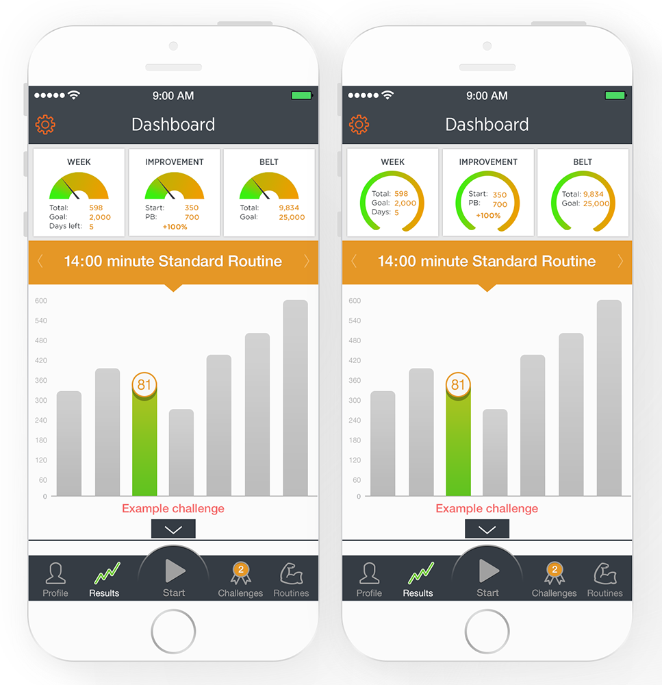
Dashboard:
The dashboard tempalte is attached. This dashboard should be inserted between the Grey banner heading and the Orange 14min standard routine bar. It will shift the graph down. The graph should remain unchanged, all you need to do in sert a cool looking dashboard inbetween the grey and orange bars
Dashboard contents:
Three dials (similar to fitbit, runkeeper etc - see attached as an example) that display your progress
Dial 1: Title: Week
Dial should change colour as score approaches goal (ideally from green to orange as per icon example attached but not necessarily if you can make it look better)
Inside the dial it needs to include
Total: 598
Goal: 2,000
Days left: 5
Dial 2: Title: Improvement
Inside the dial it needs to include:
Start: 350
PB: 700
+100% in bold, centered
Dial 3: Title: Belt
Inside the dial needs to include:
Total: 9,834
Goal: 25,000
Leaderboard Screen:
Again using the template, with the grey banner heading at the top and tab bar at the bottom:
The leaderboard should be divided into two sections. The first is for my personal scores (as a user). The second section is for all players scores.
Section 1:
- Light grey background, dark grey text. Column titles can be pressed to filter columns. When pressed title changes colour from grey to orange (bold). If you can highlight two of the column titles orange that will be good
Section 2:
- White background, dark grey text. Column titles can be pressed to filter columns.
- Row height should be quite small to fit a large number of names on the screen.
Column titles: (sorry the wireframe sketch text is tough to read)
Rank / Name / W/outs / Wins / Week / Total / Belt
Rank - numeric values from 1-999
Name - text field
W/outs - number from 1-999
Wins - number 1-999
Week - number 1 - 99,999
Total - number 1- 99,999
Belt - coloured dot (white, black, red, blue, green, yellow)
For more info, refer http://www.twofit.co/ and download the old app (iphone only) for an idea what we're after.
Tipo de industria / entidad
Fitness
Colores
Colores seleccionados por el cliente para ser utilizados en el diseño del logotipo:
Mira y siente
Cada control deslizante ilustra las características de la marca del cliente y el estilo que debe comunicar el diseño de tu logotipo.
Elegante
Atrevido
Juguetón
Serio
Tradicional
Moderno
Atractivo
Profesional
Femenino
Masculino
Vistoso
Conservador
Económico
De Alta Gama
Requisitos
Debes tener
- Use the .psd template provided. We're not looking for a redesign.
- The fonts are:
- LeckerliOne Regular
- LobsterTwo Bold
- MeriendaOne Regular
- MVBoli
- GothamExtraLight
- LobsterTwo
Agradable de tener
- The best dashboard of all time.
No debería tener
- changes to fonts,
_brief173603.jpg?AWSAccessKeyId=ASIARQT47ZIU7LCPGRED&Expires=1777291955&response-content-disposition=attachment%3Bfilename%3D%22photo%281%29%20Wednesday%2C%2017%20September%202014%2008_36_03.jpg%22&x-amz-security-token=IQoJb3JpZ2luX2VjEOL%2F%2F%2F%2F%2F%2F%2F%2F%2F%2FwEaCXVzLWVhc3QtMSJHMEUCIQCfOkWNJPlFaspoNC2MneD%2F%2FoNa2Uzz9in3BgrYutjEGQIgGezUafM8J2hYBwluUSfyIAtmJl%2FxQ9YSlrh7O94mEQMq9AMIqv%2F%2F%2F%2F%2F%2F%2F%2F%2F%2FARAAGgwxMDQ0MTUwODcxNDUiDH4ovOOBme%2BXMTS6aCrIAxrxH%2B89N3zEWTEWnSg0I%2Bw2aEwN%2Fr4lp8i0lYE7KAPOtK9egMdtAlxGBInNE9f%2B3xNOVKy%2BdyOiMNd%2FYTyZynWi6R0HtKeSBCL%2FEX5wthe%2FMQbpfy5amCYM94YT6D8wulbt2YeS%2FNRy%2BkZ3gGPlJSoKKjs9FIKI3Eno4Xf0hQRVXriBo2Zk7p46yGgZ%2FjzLk5uvmDtQ1y8dBHuV4TTQHueqnzJEzaCAyiLGwuDgmkXJ0hP6er8uQJaFCC3bx0AdY9gTfjVM4%2FjOetO0a%2Flu9OXpPr53botk5CDB04zYyqLYxAo%2BPa2flX94OjH0Uc0G8%2FqUE1g7Dgngi%2FgulIqbnhdj30sjGIhTDi0udSWQ61znpEWpfx%2Bm%2F4FPDtO5ikpaBSRTH3fwSjHWX5jaoodygC0bJ68d2vYCh%2FAsXZIBWYl5oh%2FTkWHlQepz9gUAA4%2FcHqNAY8ZtyX07kEH0nZgS11ZSTwuOKnXL%2F4YDxiIDIxmx0pua6wGuKZq9oFi3nNNePe%2BBtEOeQIboBHCi7dpOVdNE%2BH%2FVYgTHAdL7yo2Gygytke3vmLFiDJJpE8vSmkOJwKm1%2BAL4EwKA2WdYxgV73uqbHtnUs%2B3%2BvDCvrbfPBjqlAQCqqd0nRpNtZHvNmu260qj5CNjK86QQ%2B6n2tFJgd1v4PWotN3NwY20%2FHGh5%2FxnTgovlo%2FlZzlHJFTISKwvVvvM4kZTK%2BPl%2FEwjbfc2xiy5cCiMBMLtKlPu2Bh28VMwaH3ITrmMurm4miQ1NlcmAxg43nS%2B%2B38HMaWU0SCEuKsANdiTzX3JkE%2FhTcFhMNwP5mjUHDcPPPtMrB9ticqbHFdVErY7nRA%3D%3D&Signature=Hksk928FBw7hmh7IVwC%2BS%2BsiMUo%3D)