Kiddo Kingdom, Bounce House Inflatable Entertainment Center and rentals!
¿Quieres ganar un trabajo como este?
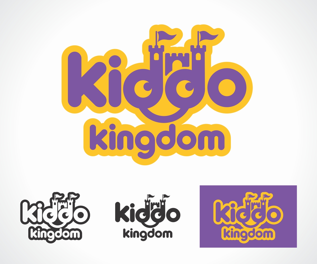
Este cliente recibió 121 diseños de logo de 25 diseñadores. Eligieron este diseño de logo de Gerard como el diseño ganador.
Únete gratis Encuentra trabajos de diseño- Garantía
-
 US$400
-
 121 diseños
-
 25 diseñadores
Resumen de Diseño de Logo
We are an inflatable bounce house entertainment center. We need a logo that communicates FUN! The owner of this new start-up has been a professional clown of 15 years and currently rents bounce houses (aka moonwalks) for private use at birthday parties, etc. His current website is kiddotainment.com.
We will be a party destination source, like chuck-e-cheese. We'll offer party packages with private rooms, full catering and attendants. We'll also offer pop-in play for single kids who just want quick fun, without an appointment or special occasion.
Similar businesses in our area are...
pumpitupparty.com (national chain)
inflatablewonderland.com
locomotionplay.net
thebigbouncetx.com
kidznplay.net
extremefun-tx.com
wazoospartyaustin.com
zoomerangplay.com
In my personal opinion, all of the logos above seem very unprofessional, too busy and/or lack a clear conveyance of the business model.
While I have my own personal bias vision of what our logo could look like, I don't want to limit you too much. One or two colors is fine or a whole rainbow could work too, like the kiddotainment.com logo. While a subtle design would be refreshing, being obvious and obnoxious is probably the best bet, wouldn't most people agree? I'm just guessing.
I've attached some thumbs we quickly worked on. Use them as inspiration. Expand on them or scrap them.
Please let your creative juices flow in this contest. We're very open to new concepts and ideas for this type of logo. Don't get crazy, just get the idea across.
Actualizaciones
Project Deadline Extended
Reason: In the hopes of drawing out everyones potential, we want to provide additional feedback to everyone's designs and we need more time to do that. We apologize for not getting back to many of you in a timely manner. Adding 10 days give's everyone an additional weekend.
Thank you all for the wonderful submissions, thus far! With all the great choices this may truly come down to the wire.
Added Friday, January 11, 2013
Objetivo del mercado(s)
Kids 12 and under, Parents of those kids
Tipo de industria / entidad
Catering
Texto del logo
Kiddo Kingdom
Requisitos
Debes tener
- Replacing a letter or two with a symbol would be cool. But be careful not to over do it.
Agradable de tener
- A cool tagline:
Feel free to suggest anything for the tagline. No need to spend a lot of time on a tagline nor should you feel compelled to even create one. If you decide to use a tagline, I suggest to not let it restrict your design as we may not even use the tagline.
A castle theme or suggestion:
The owner was wanting to incorporate an entire castle surrounding the text, so that may be fun to play with, but it is not required.
No debería tener
- The over used, redundant, played out oval perimeter. Please do not use that in the logo, unless you feel you have no choice. If this offends anyone, I apologize as I don't mean to discourage you from participating.
Abstract. If you have an abstract design suggestion, please provide an explanation.