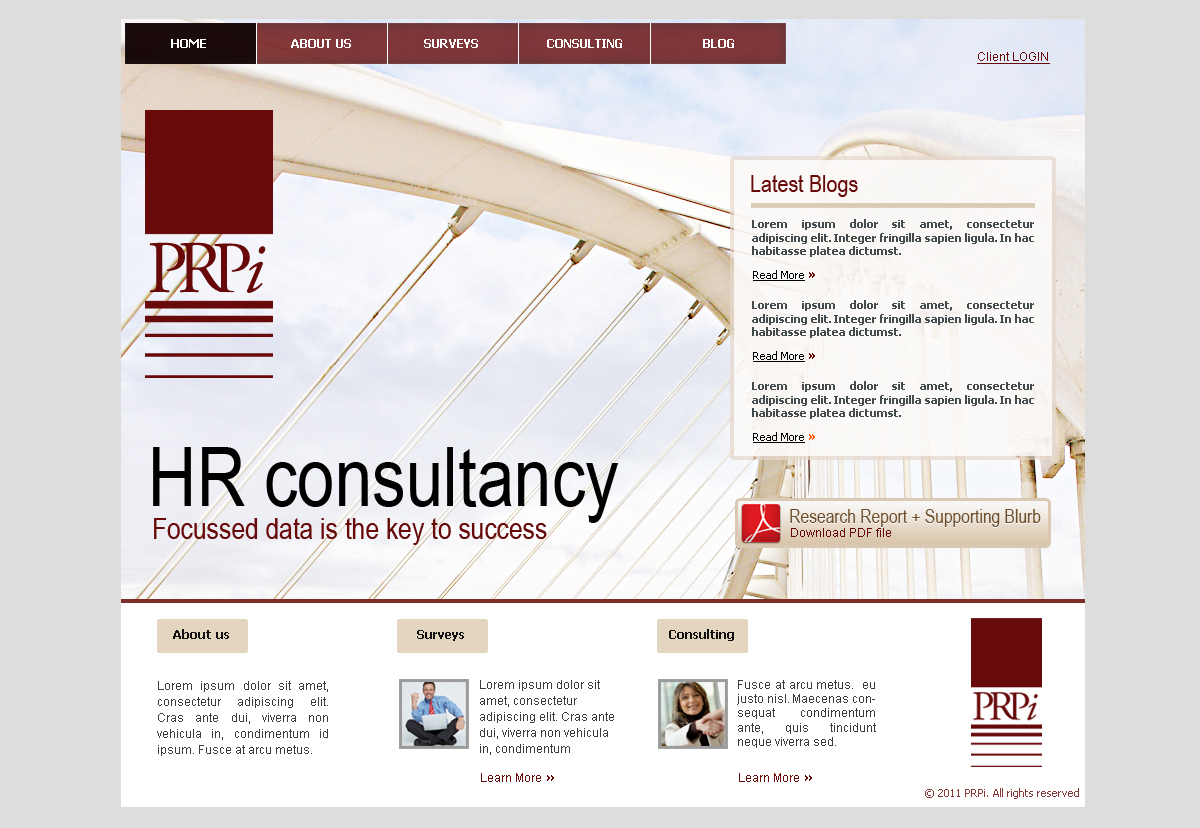
Website for a financial survey consultancy

¿Quieres ganar un trabajo como este?
Este cliente recibió 49 diseños web de 10 diseñadores. Eligieron este diseño web de James como el diseño ganador.
Únete gratis Encuentra trabajos de diseño- Garantía
Resumen de Diseño Web
WHO WE ARE
We're a niche HR consultancy specialising in salary comparison surveys for the financial asset management industry. We position ourselves as a small, highly responsive organisation with a strong personal relationship with each of our 50+ blue-chip clients.
WHAT WE DO
Our business is 80% surveys (= products), 20% consultancy (= services). The surveys are a set of online products which clients interact with to find the information they are interested in.
WHAT WE WANT
We are completely revising our existing marketing website and need a new up-to-date look and feel for the site. We want you to design 2 web pages
- Home page
- Internal content page
More details below in Must Have Priorities.
REFERENCE SITES
- www.blackrock.com - nice background image
- www.schroders.com - ignoring the animations
- www.frontierim.com
- www.envato.com - clean, fresh, styly but prob not corporate enough
- www.samenacapital.com - spacious, beautiful, slightly dated tho
- www.ruffer.co.uk - ignore the colours. Like the simplicity, larger font size (although want to stick with sans-serif fonts for main content)
DELIVERABLES
The final designs should be delivered as one or more PSD files with clearly named layers. All design elements and treatments should be separated out, for example use adjustment layers rather than applied (and subsequently irreversible) adjustments, strokes, shading, etc.
WHAT NEXT
I'll be monitoring the contest every day and can respond to questions fast. You can IM me on Skype or MSN.
Actualizaciones
Project Deadline Extended
Reason: Hi folks,
I am extending the deadline to this project as I am travelling this week and therefore will not be able to make a final decision until next Monday. I will try and provide further feedback over the course of this week but I am only going to be online occasionally so be prepared to wait a few days for a reply from me.
Thanks for all the designs so far.
Mark
Added Monday, February 28, 2011
Objetivo del mercado(s)
In order of importance, most important first
1. Potential customers - UK & US financial industry HR professionals, short on time. Heard about us already, want to find out more about what we do, confirm relevance for their needs. Core goal - establish credibility: are we properly resourced, will we be around for years to come, are we *real*.
2. Existing customers - UK & US financial industry professionals, short on time, under pressure, want results quickly, minimum faff, expect high quality, slickly presented information. Primary action: login and use surveys.
3. Industry professionals/researchers - probably arriving through blog content, looking to browse and hoover information. Valuable for their ability to spread awareness of who we are amongst their peers.
Tipo de industria / entidad
Financial
Mira y siente
Cada control deslizante ilustra las características de la marca del cliente y el estilo que debe comunicar el diseño de tu logotipo.
Elegante
Atrevido
Juguetón
Serio
Tradicional
Moderno
Atractivo
Profesional
Femenino
Masculino
Vistoso
Conservador
Económico
De Alta Gama
Requisitos
Debes tener
- GENERAL
Style cues - Corporate, professional, financial, stylish, slick, clean, spacious, light
Size - standard 960px grid
NAVIGATION
- [ Home | About us | Surveys | Consulting | Blog ]
- Sub-nav (roll-over dropdown) on About Us, Surveys & Consulting
ALL PAGES
- Site navigation
- Client login (on screen permanently or link to ajaxy in-page pop-up)
- Footer section
- Existing logo (attached)* - this is obviously an important reference point in the design, esp colour
HOME PAGE
- Communicate (link thru to?) survey/consulting split
- Large photo(s)/backdrop (2-3 interchangeable options ideally). Please consider what rights agreement will be necessary for any photos you include in your design.
- Possibly bigger more prominent version of logo
- Strap line/sentence - "Focussed data is the key to success"
- 3 recent blog posts (should look good with and without blog post images)
- Free downloadable PDF research report + supporting blurb
INTERNAL PAGE
- Page title
- Content - typical page will be less than one screenfull
- Level 1 sub-heading
- Level 2 sub-heading
- Bulleted list
- Content supporting image (any image will do - interested in placement, borders (if any), spacing, caption, etc)
- 'Do something' button
* Note: there is some internal debate about this logo at the moment. Some (me) are keen for it to change, some (not me!) are not. If you have an web page design idea/concept that requires an evolution of the logo, go ahead and evolve it. We can explore this further in the design process as necessary, but don't sweat it.
Agradable de tener
- Values to communicate
- Knowledgeable
- Professional
- Secure
- Personal
- Experienced
- Financial industry specific
- Accurate
- Reliable
No debería tener
- - Search box
- Social media links, other than RSS feed button (discrete)
Note: The first two image links below are broken. Try the 3rd one.