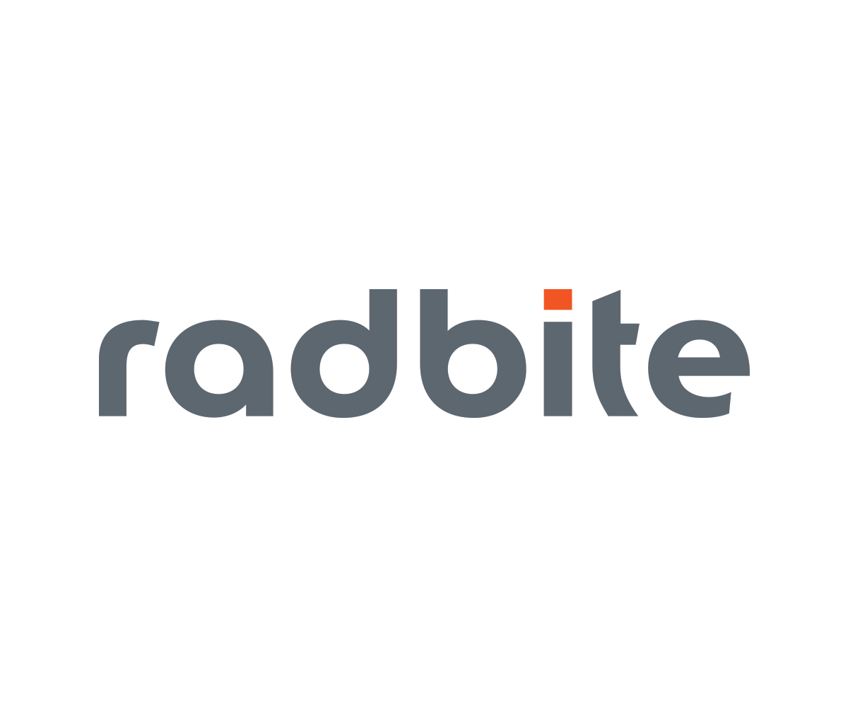
Digital Agency Needs a Simple but Unique Logo

¿Quieres ganar un trabajo como este?
Este cliente recibió 107 diseños de logo de 44 diseñadores. Eligieron este diseño de logo de Christian Champagne como el diseño ganador.
Únete gratis Encuentra trabajos de diseño- Garantía
Resumen de Diseño de Logo
Logo of a new digital agency. The name comes from “radical bite” but as our main field of business is going to be digital services (programming, design + e-commerce) and the name outspoken has also a meaning of the radical byte. But please think out of the box. It should not be some kind of direct relation to programming 0101, courier font, etc. Not technical rather emotional.
The brands philosophy is “trying to keep things simple”. Lots of digital agencies try to persuade clients how complicated the whole thing is, we say a content and function. So a perfectly chosen modern font in a trending colour and a unique symbol before the wordmark would be just perfect. But we are aware of the fact that this is also the hardest part. To come with a symbol which is easy clean but not childish and poor.
Part of the job is to suggest a font which corresponds with the logo. It would be most probably not the font of the wordmark.
SOME DETAILS ABOUT THE LOGO:
Font:
Sans Serif (but I could agree with a Serif font too)
text: “radbite” not “Radbite or RadBite”
Colour:
NO: red, no rose
YES: cooler softer, can be also warm but we might like also neon colours. Not necessarily blue or green. feminine colours work also for us orange, yellow.
Symbol:
- minimalistic
What we like:
1. http://www.zendesk.com
Beautifully simple :) Clean easy, very good font on the web - also quite good in the logo
2. Pinterest
3. Apple :)
4. airbnb
5. waze
Logos which are good, but we do not really like:
1. Yahoo!
2. Google
Objetivo del mercado(s)
Global
Tipo de industria / entidad
Digital
Texto del logo
radbite
Estilos de logo de interés
Logo abstracto
Conceptual / simbólico (texto opcional)
Logo con siglas
Acrónimo o logo tipográfico (solo texto)
Estilos de fuente para usar
Mira y siente
Cada control deslizante ilustra las características de la marca del cliente y el estilo que debe comunicar el diseño de tu logotipo.
Elegante
Atrevido
Juguetón
Serio
Tradicional
Moderno
Atractivo
Profesional
Femenino
Masculino
Vistoso
Conservador
Económico
De Alta Gama
Requisitos
Debes tener
- the symbol is not a must have if the wordmark is just great itself
Agradable de tener
- a unique symbol