Natural Foods Start-up Needs a Snack Food Packaging Design
¿Quieres ganar un trabajo como este?
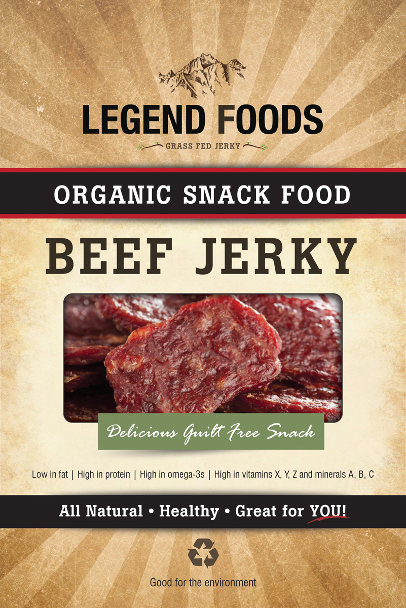
Este cliente recibió 15 diseños de empaque de 10 diseñadores. Eligieron este diseño de empaque de Jackie Morrison como el diseño ganador.
Únete gratis Encuentra trabajos de diseño- Garantía
-
 US$160
-
 15 diseños
-
 10 diseñadores
Resumen de Diseño de Empaque
We are a natural foods company doing it differently. We don’t care about the need for consumers to make better food choices according to their enlightened self-interest. Let’s face it, their own health or the planet’s health often doesn’t REALLY matter to them. So it doesn’t drive us. The bottom line is that they want food that tastes damn good. It’s OUR job to make sure it is healthy and sustainable, all while tasting better than industrial alternatives.
We are launching a line of a carnivorous/high protein food. Think nutritious value of fish but tastes nothing like fish. Think snack, fast food, something that truck drivers would like (heard the 5-hour ENERGY story? Learn in!). Food that you eat with your fingers, and you lick your fingers when you are done, maybe tasting some of the motor oil that is left on your fingers from the oil change you did yourself on your BMW.
We are “Legend” because we want to be big but not grand. We are to the point, and use plain language. We use words like “Epic” and “Big” and “More” and “Sky”. Think Montana. Unfortunately, we are not very intuitive. But we don’t try too hard either, we don’t say we are “tough” or “hardy” or make any overwrought claims at all. We are a bit masculine, but the type of masculine energy that women don’t mind sometimes adopting themselves (of course we are not even a little sexist or asshole).
Package Design Guidelines
Package should be a clean, modern design that very simply tells you what is inside and why you should eat it. Should communicate good tasting food. Should also communicate “good for you” and “good for the planet” but these points should feel like afterthoughts.Remember, the customer buys this because it tastes good—later seeing that it is sustainable and healthy will only provide confirmation that they made the right choice (but NOT be the reason why they bought).
Name of product (for now) is “Legend FoodOrganic Snack Food” (please use these words as a placeholder). This should be prominently displayed on the package, using a large typeface. “Legend Food” can be larger than “Organic Snack Food”. Words like “Low in fat, high in protein, high in omega-3s, high in vitamins X, Y, Z and minerals A, B, C” should be displayed on the package front. Package should be the size/proportion of a small potato chip bag. Bag will be compostable plastic and will need a very large, prominent window to see product sealed inside.
Food comes in pieces and you can reach inside and pull one out and snack on it. It might compete with chips, beef jerky, nuts, or other such snacks. Should appeal to young buyers, probably mostly young professional men at first, but should also be accessible to women and children.
This Project is linked to Logo Design Project: http://jobs.designcrowd.com/job.aspx?id=841184
Tipo de industria / entidad
It Company
Mira y siente
Cada control deslizante ilustra las características de la marca del cliente y el estilo que debe comunicar el diseño de tu logotipo.