Labour Hire Co. Billboard Design
¿Quieres ganar un trabajo como este?
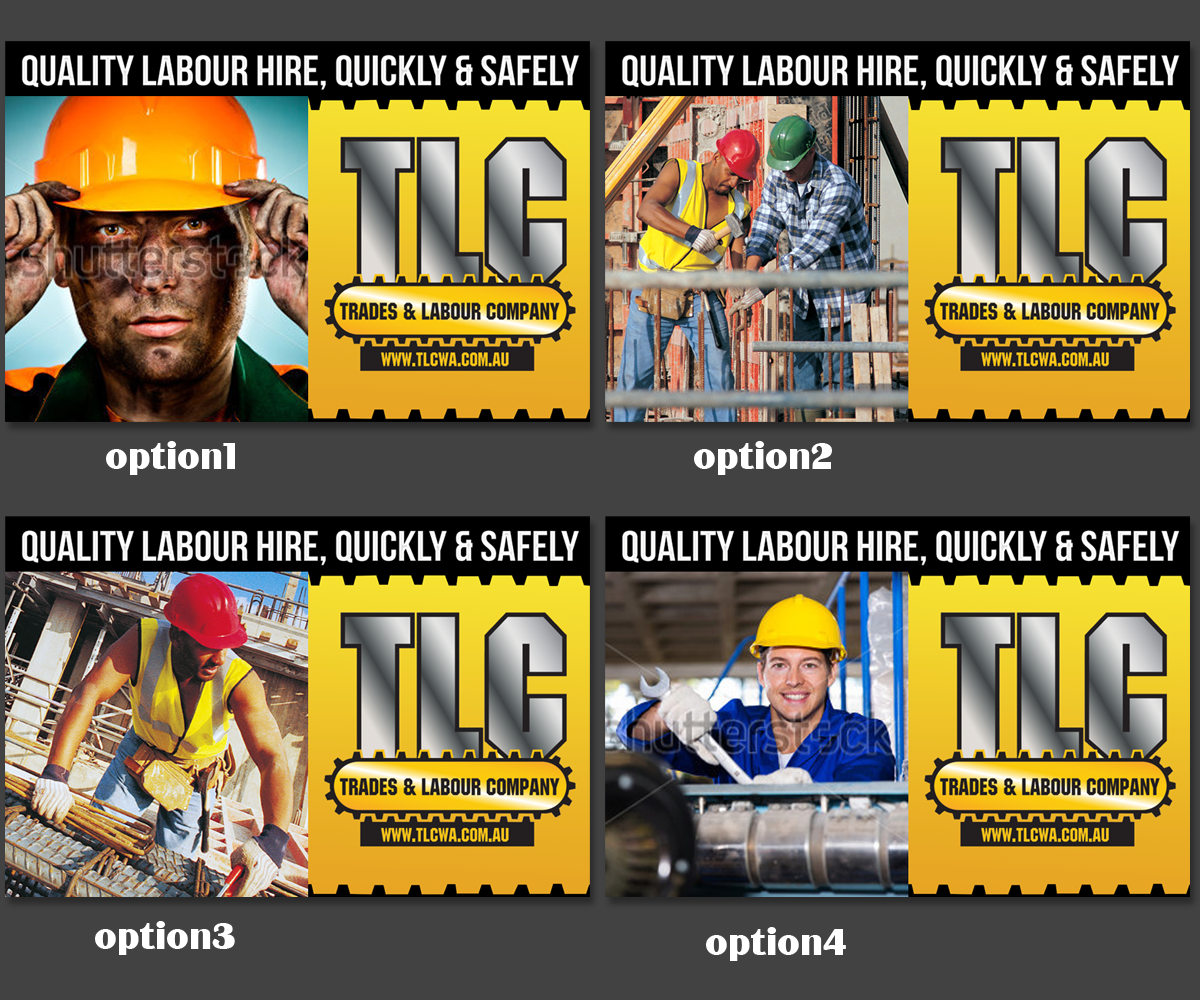
Este cliente recibió 14 diseños de cartelera de 4 diseñadores. Eligieron este diseño de cartelera de ravi_k5 como el diseño ganador.
Únete gratis Encuentra trabajos de diseño-
 A$130
A$130
-
 14 diseños
-
 4 diseñadores
Resumen de Diseño de Cartelera
We have a billboard (pic attached in the brief) that we want a design for our other company..
The company - TLC supplies trades to the mining, maintenance, fabrication and construction industries.
People drive by this billboard at speed 80kmh, so an obvious, in your face, simple message and graphics are essential - including a large logo so it can be seen from a distance.
Objetivo del mercado(s)
Managers of heavy industrial companies. Note, we are not using this billboard to target candidates / employees. Our audience for this billboard is managers and executives. Our aim is brand recognition.
Tipo de industria / entidad
Construction
Estilos de fuente para usar
Colores
Colores seleccionados por el cliente para ser utilizados en el diseño del logotipo:
Mira y siente
Cada control deslizante ilustra las características de la marca del cliente y el estilo que debe comunicar el diseño de tu logotipo.
Elegante
Atrevido
Juguetón
Serio
Tradicional
Moderno
Atractivo
Profesional
Femenino
Masculino
Vistoso
Conservador
Económico
De Alta Gama
Requisitos
Debes tener
- Simplicity
- Eye Catching
- Credible
- Consistent with our brand - See www.tlcwa.com.au
- Note, only the top 2/3rds of the billboard is viewable so take this into account with the design. The logo should really be the website inside the design of our logo, i.e. the same graphic as our logo, but quoting the website.
- Tag line could be "Quality tradespeople - quickly and safely" Please feel free to come up with alternatives. We are open to ideas though.
Agradable de tener
- See the images attached, previously we have tried to be clever with this billboard, i.e. man climbing up the roof, etc.
- Perhaps here we could have a tradesperson on a worksite/ minesite repairing the top of the billboard so it blends cleverly into the landscape. But skip this step if it takes away from the effect of the billboard.
No debería tener
- Too wordy, or small so it cannot be worked out in 2 seconds of looking at it.
- Colours other than our our corporate colours.