Poitiers 2011
¿Quieres ganar un trabajo como este?
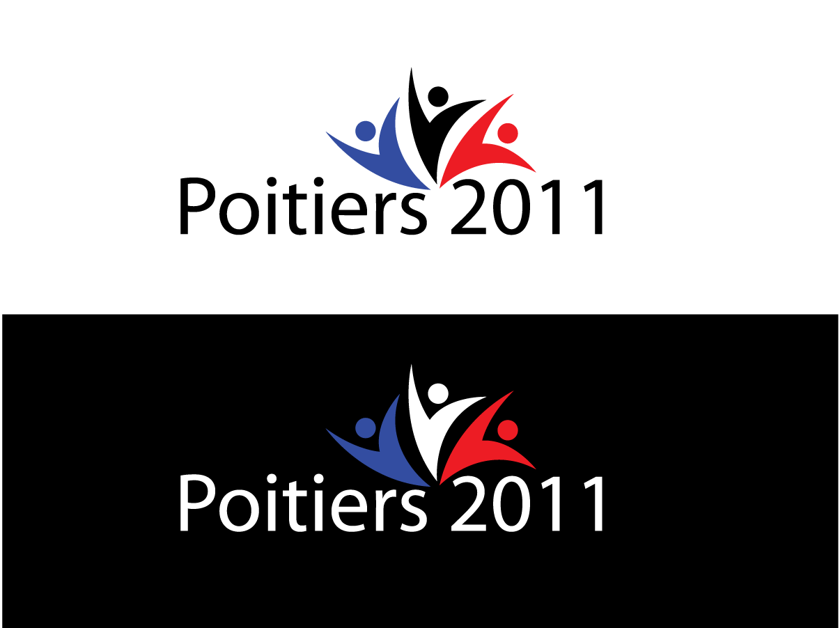
Este cliente recibió 164 diseños de logo de 55 diseñadores. Eligieron este diseño de logo de Robi como el diseño ganador.
Únete gratis Encuentra trabajos de diseño- Garantía
-
 US$890
-
 164 diseños
-
 55 diseñadores
Resumen de Diseño de Logo
I want a logo for T-Shirts and Baseball caps for a Church retreat to France this year.
The retreat is to a chateaux - see www.chateaustjulien.com
Previous years have had a logo with the outline of the chateau or the word Poitiers but with the letters coloured blue white red to suggest the French flag
The year 2011 should feature but in such a way that we can just change the year next year and keep the same logo. Possible ideas to try and incorporate:
France - something french - french flag
The Chateaux - an outline or silouhette
I like simple designs with not too much going on so try to keep it elegant.
The word "Poitiers" can be part of the design or a word underneath.
It should be easily recognisable as an icon on a T Shirt about 4 inches wide and 3 inches high.
Good Luck!
Actualizaciones
Dear All
Thank you for all the designs - however none of them are quite right so I thought it might help if I shared some further ideas I have had when looking at them.
1. Try a dark background - very dark blue for example - because it is not yet known what colour the garments will be.
2. Try using the "i t i" in Poitiers to make a very simple suggestion of a chateau - not too complex - just maybe making the dots on the i triangular to suggest a turret for example.
3. I wondered about suggesting the French flag by way oof a very simple crayon style shading behind the words - like http://www.shutterstock.com/pic-26520502/stock-photo-color-pencil-with-color-shading-isolated.html
But using a crayon style shading - and then changing the colour of the shading to Blue - white - red - to suggest the French flag. It might look better if the "reveal" was quite precise - ie the colour changes midway through each stroke so that the line dividing the colours was straight and vertical.
4. This is a Church event - so a suggesting of people together having a good time.
I very much prefer simple designs - no clutter - do not try to communicate more than 2 ideas - eg people and france - or people and the chateau - or france and the chateau.
And please use the most simple font you can find - arial or something similar.
Hope this all helps and good luck!
Added Saturday, March 26, 2011
Objetivo del mercado(s)
See brief
Tipo de industria / entidad
Flag
Texto del logo
Poitiers 2011
Estilos de logo de interés
Logo con emblema
Logo contenido dentro una forma / figura
Logo pictórico / combinado
Un objeto del mundo real (texto opcional)
Logo abstracto
Conceptual / simbólico (texto opcional)
Mira y siente
Cada control deslizante ilustra las características de la marca del cliente y el estilo que debe comunicar el diseño de tu logotipo.