business card for new biz
¿Quieres ganar un trabajo como este?
Este cliente recibió 22 diseños de tarjeta de presentación de 5 diseñadores. Eligieron este diseño de tarjeta de presentación de Poonam Gupta como el diseño ganador.
Únete gratis Encuentra trabajos de diseño- Garantía
-
 US$80
US$80
-
 22 diseños
-
 5 diseñadores
Resumen de Diseño de Tarjeta de Presentación
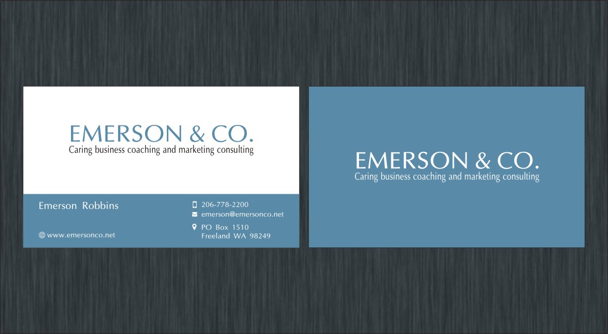
A business card that looks professional, but is also attractive and just slightly more than conservative. I would like to see either a white background with the type in gray and a shade of blue used as an accent color. The design can be very similar, if not exactly like the card design that I submitted, with a change in information (company name and contact information).
The heading will read: EMERSON & CO. (using an ampersand). the sub-heading to read: Caring business coaching and marketing consulting
Card should also have address of PO Box 1510 Freeland, WA 98249.
Phone should be 206 778 - 2200 and email of emerson@emersonco.net.
I do not have nor do I need a logo. The font used and the ampersand will serve as my logo. Please use a san-serif or a font close to that, that is classy and not too heavy. I like the font used in SALERA, per the card design attached.
Objetivo del mercado(s)
local businesses that need help with business coaching and marketing consulting
Tipo de industria / entidad
Marketing
Información de contacto para la tarjeta del negocio
A clean, professional looking card.
Estilos de fuente para usar
Colores
Colores seleccionados por el cliente para ser utilizados en el diseño del logotipo:
Mira y siente
Cada control deslizante ilustra las características de la marca del cliente y el estilo que debe comunicar el diseño de tu logotipo.
Elegante
Atrevido
Juguetón
Serio
Tradicional
Moderno
Atractivo
Profesional
Femenino
Masculino
Vistoso
Conservador
Económico
De Alta Gama
Requisitos
Debes tener
- a font similar to Michelangelo (an elegant sans serif font) for company name and sub-title. .
- using an attractive and distinctive ampersand.
- Background colors gray or white with accent color of blue
- All information on front. The primary color used for card should be the entire back. Back would have no type, just the solid color.
Agradable de tener
- A good usage of blue as an accent color to enhance an otherwise conservative business card.
No debería tener
- any other colors aside from gray, blue and white