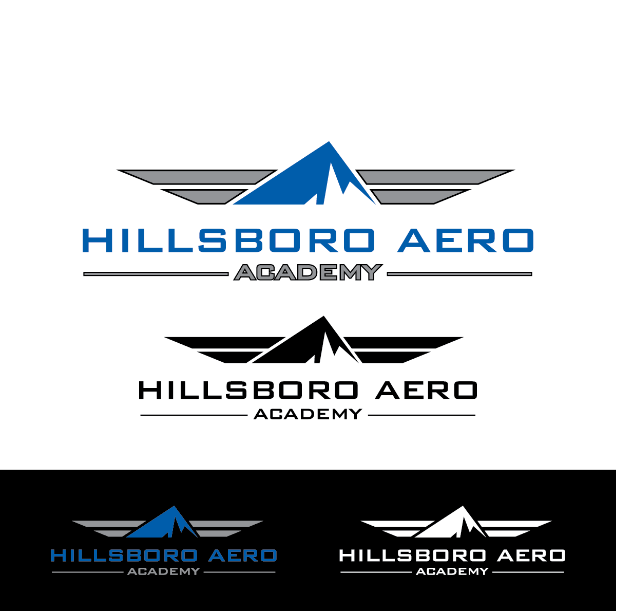
Hillsboro Aero Academy Logo
¿Quieres ganar un trabajo como este?
Este cliente recibió 101 diseños de logo de 37 diseñadores. Eligieron este diseño de logo de design supplier como el diseño ganador.
Únete gratis Encuentra trabajos de diseño- Garantía
-
 US$320
-
 101 diseños
-
 37 diseñadores
Resumen de Diseño de Logo
We need a logo for our professional flight training academy. Our flight training academy was recently sold from its parent company and is now forming under a new name and needs a new logo.
Under our parent company we were in business for 34 years and became an internationally recognized flight training academy. We train future professional airplane and helicopter pilots in the United States from all around the world.
We have used designcrowd for an earlier version of our logo. That process led us to further refinement of our goals and ideas for the logo but incorporated some aspects of the logo that was too similar to some others in our industry to be able to use. We have attached a copy of the design that came from designcrowd here as a POTENTIAL starting point. We are very open to using these wings and colors as a starting point OR are interested in those that look different than this. We decided not to use these exact design because of its similarities with other "HA" logos.
**We are strongly leaning away from logos that include our initials into the logo itself between the wings but instead ask you to consider what deign or iconic symbols you could insert between the wings to represent our "upward movement" value (see #2 below). ***
Some guidelines for our logo:
1.) In the world of pilot training "earning your wings" is a significant step and denotes success in flight school. We like the idea of using some sort of wings in our logo for this reason. A logo that looks like wings that a pilot may wear on his uniform is a good idea but we are very open to variations on that theme as long as it takes into account the wing idea and the other items listed here.
2.) We also really like the idea of upward movement, climbing and/or rising. It is important to us that this aspect be clear in the logo in that it is similar to the climbing nature of both our aircraft and the student's career as a pilot. In addition to the use of wings in the logo clear use of some sort of upward movement symbolism or shape to the wings is a must.
3.) We like a simpler more iconic type of logo as opposed to a more ornate and complicated one. Simpler wings that look less bird-like (no feathers please) and more sleek and stylish are preferred. While we are open to graphical representations of our company's initials (HAA) I would MUCH prefer variations that utilize the "upward" idea (see #2 above) and less based on our initials. There are many examples of pilot wings with a company's initials placed in an oval between the wings, that is not unique. We are looking for something different than that.
4.) All designs submitted should not be airplane or helicopter specific as we train both kinds of pilots. The use of wings is recognized by all types of pilots.
5.) As for colors we like blues, grays and blacks but are open to accent colors to provide depth if they blend well but add some "pop" to the logo.
If I was going to communicate three values through my logo they would be:
1.) Professionalism
2.) Movement, (up, climbing)
3.) Adventure (learning to fly is often the fulfillment of our student's life long dreams and adventures)
Thank you for your efforts
Objetivo del mercado(s)
18-24 year old male from around the world. They are interested in adventure and a challenge.
Tipo de industria / entidad
Training
Texto del logo
Hillsboro Aero Academy
Estilos de logo de interés
Logo pictórico / combinado
Un objeto del mundo real (texto opcional)
Logo abstracto
Conceptual / simbólico (texto opcional)
Colores
Colores seleccionados por el cliente para ser utilizados en el diseño del logotipo:
Mira y siente
Cada control deslizante ilustra las características de la marca del cliente y el estilo que debe comunicar el diseño de tu logotipo.
Elegante
Atrevido
Juguetón
Serio
Tradicional
Moderno
Atractivo
Profesional
Femenino
Masculino
Vistoso
Conservador
Económico
De Alta Gama
Requisitos
Debes tener
- Relatively simple, iconic type of logo that will work well in an avitar format if needed. Signifiant emphasis on the idea of pilot's wings. Also significant emphasis on the "going up," upward movement or climbing type of symbolism and design.
No debería tener
- Wings should not look bird like with feathers.