Patient Satisfaction
¿Quieres ganar un trabajo como este?
Este cliente recibió 67 diseños de app de 6 diseñadores. Eligieron este diseño de aplicación (App) de SergeyBrin como el diseño ganador.
Únete gratis Encuentra trabajos de diseño- Garantía
-
 US$320
-
 67 diseños
-
 6 diseñadores
Resumen de Diseño de aplicación (App)
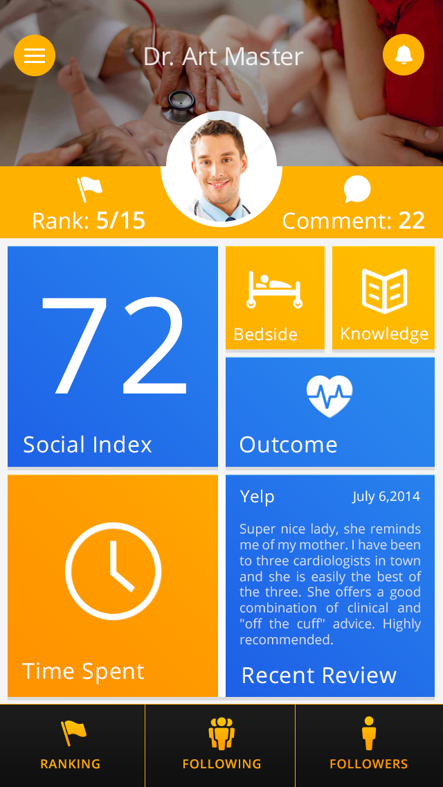
We are extending our social listening and intelligence platform for Physicians to patient satisfaction app. Our platform monitors social media and review sites and collects, classifies and distilled patient satisfaction into nine Categories - Thoroughness, Answers Q's, Collaborative, Caring, Time Spent, Previous Success, Instruction Clarity, Follow-up and Reputation
The app will have three main states: (1) Home state showing the metric for each category, (2) a detailed page for each Category showing the metric, topics discussed and sites sourced, (3) Leaderboard showing Physicians with best scores.
If you follow our wireframes, please take liberty to extend it. We like the Windows 8 tiles, but our wireframes fall far short of meeting its coolness and usefulness. For example, we don't have different size tiles, and would live them, or content on the tiles to make them more meaningful. [Note: use SI instead of BFF.]
Actualizaciones
The designs submitted to date look great, but they reminded me that my instructions were unclear.
Feel free to follow the wireframes if you like the UI, but we also welcome your thoughts on UI in addition to look and feel. If you follow our wireframes, please take liberty to extend it. We like the Windows 8 tile, but our wireframes falls far short of meeting its coolness and usefulness. For example, we don't have different size tiles or content on the tiles to make them more meaningful.
If you've submitted designs, please feel free to revise them or submit a different look. And if you haven't submitted designs, please feel free to give us your best thoughts on UI and design.
Added Tuesday, December 02, 2014
Objetivo del mercado(s)
US Physicians
Tipo de industria / entidad
Media
Estilos de fuente para usar
Colores
Colores seleccionados por el cliente para ser utilizados en el diseño del logotipo:
Mira y siente
Cada control deslizante ilustra las características de la marca del cliente y el estilo que debe comunicar el diseño de tu logotipo.
Elegante
Atrevido
Juguetón
Serio
Tradicional
Moderno
Atractivo
Profesional
Femenino
Masculino
Vistoso
Conservador
Económico
De Alta Gama
Requisitos
Debes tener
- Home state
Visual icons
Agradable de tener
- Leaderbaord