

 Refresh
DLSA WEBSITE
¿Quieres ganar un trabajo como este?
Este cliente recibió 70 diseños web de 11 diseñadores. Eligieron este diseño web de pb como el diseño ganador.
Únete gratis Encuentra trabajos de diseño
- Garantía
-
 A$1150
-
 70 diseños
-
 11 diseñadores
Resumen de Diseño Web
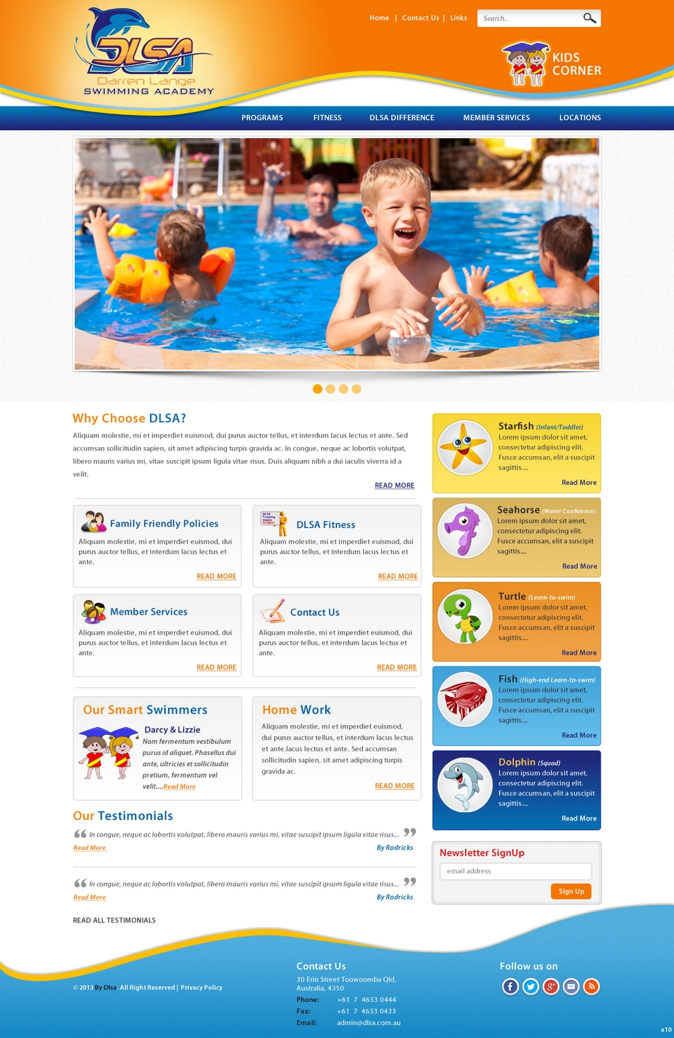
I am looking to redesign our website into the Joomla CMS.
We are a large swim school with multiple sites and more on the way.
We deal primarily with water safety and learn-to-swim skills from babies to 10 years of age and conduct swimming lessons for all ages & ability levels.
You can view our current site at www.dlsa.com.au
The new site needs to be modern, bright, exciting & professional. It should be based around our logo colours of varying blue's and golden yellow etc but other contrasting colours can be used to give the page some depth/excitement.
Our website is frequented by mums (mostly) & dads between the age of 25 & 45, so we are looking to appeal to this target market.
We have recently revamped our logo (attached) and of course would need to incorporate it into our new website.
We have also developed 2 mascots for our program, Darcy & Lizzie (attached). These 2 mascots represent the children who have completed our program and graduated from water safety/learn-to-swim program.
We are also introducing 5 characters to represent various sections of our swim program:
* Starfish - Infant/Toddler
* Seahorse - Water Confidence
* Turtle - Learn-to-swim
* Fish - High-end Learn-to-swim
* Dolphin - Squad
I would like to have these incorporated into the page design.
This site will be the first point of contact for mums and dads looking to enrole their children into swimming. As such, I am keen to see that the first thing customers will note is 'Why choose DLSA?' as a link to our 'DLSA Difference' pages.
Secondary to this would be the program overview information.
Then Member Services information etc.
NEW INFO ADDED 11TH FEBRUARY:
As we move through the design process we have been able to identify some design 'must haves' that we didn't know of before. Please notes as follows:
1. We are tending towards more of a flowing 'wave like' design for the header & footer.
2. The water characters used to promote the different programs should be listed vertically on the righthand side of the page.
3. 'Why choose DLSA? should have a very prominent position on the page.
4. Priority items on the page from there would be;
- Family Friendly Policies
- DLSA Fitness
- Member Servies
- More info
- Testimonials
- DLSA Mascot info
- DLSA Newsletter sign up

Actualizaciones
Hi Designers.
Added Sunday, February 03, 2013
I've had some fantastic designs coming through, all of which have enabled me to further consider exactly what we are looking for. I have made some minor changes to the brief now that I am more certain of a few things, namely; I do want the sea animal characters worked into the design. I also want to ensure that the first customers notice when coming onto the site is 'Why choose the DLSA?' as a link to our DLSA Difference pages.
Added Tuesday, February 05, 2013
Hi Designers!
Added Monday, February 11, 2013
Objetivo del mercado(s)
Mums & dads 25 - 45 with a kids theme.
Tipo de industria / entidad
School
Mira y siente
Cada control deslizante ilustra las características de la marca del cliente y el estilo que debe comunicar el diseño de tu logotipo.
Elegante
Atrevido
Juguetón
Serio
Tradicional
Moderno
Atractivo
Profesional
Femenino
Masculino
Vistoso
Conservador
Económico
De Alta Gama
Requisitos
Debes tener
- Must be able to load into the Joolma CMS.
The first thing a customer must notice when opening our page is 'Why choose DLSA?'

