Superposition: Logo merging arts and physics

¿Quieres ganar un trabajo como este?
Este cliente recibió 68 diseños de logo de 18 diseñadores. Eligieron este diseño de logo de Natan como el diseño ganador.
Únete gratis Encuentra trabajos de diseño- Garantía
Resumen de Diseño de Logo
Superposition
Superposition is a collaboration between an artist and physicist, hosted by the Institute of Physics.
We’re pairing the two to facilitate conversation, drawing similarities between the artistic and scientific processes. The title Superposition is based on the quantum mechanics idea that a particle is in two places at once. The concept says that you can never know where a particle is until it is measured. We hope the project serves a similar process, blurring the line between art and science, allowing the audience to question where art and science differ and where they are the same.
The main audience we’re aiming to reach is engaged with the arts. The project will take place in London, so we want to appeal to the young, culturally aware set who regularly attend contemporary exhibitions in a range of mediums.
The logo doesn’t need to have any overt references to science, but should draw a natural parallel as in the examples like resembling a draft plan, including mathematical notation etc. The logo should naturally appeal to those with an existing interest in the arts. The science should come as a second, pleasant and unexpected surprise.
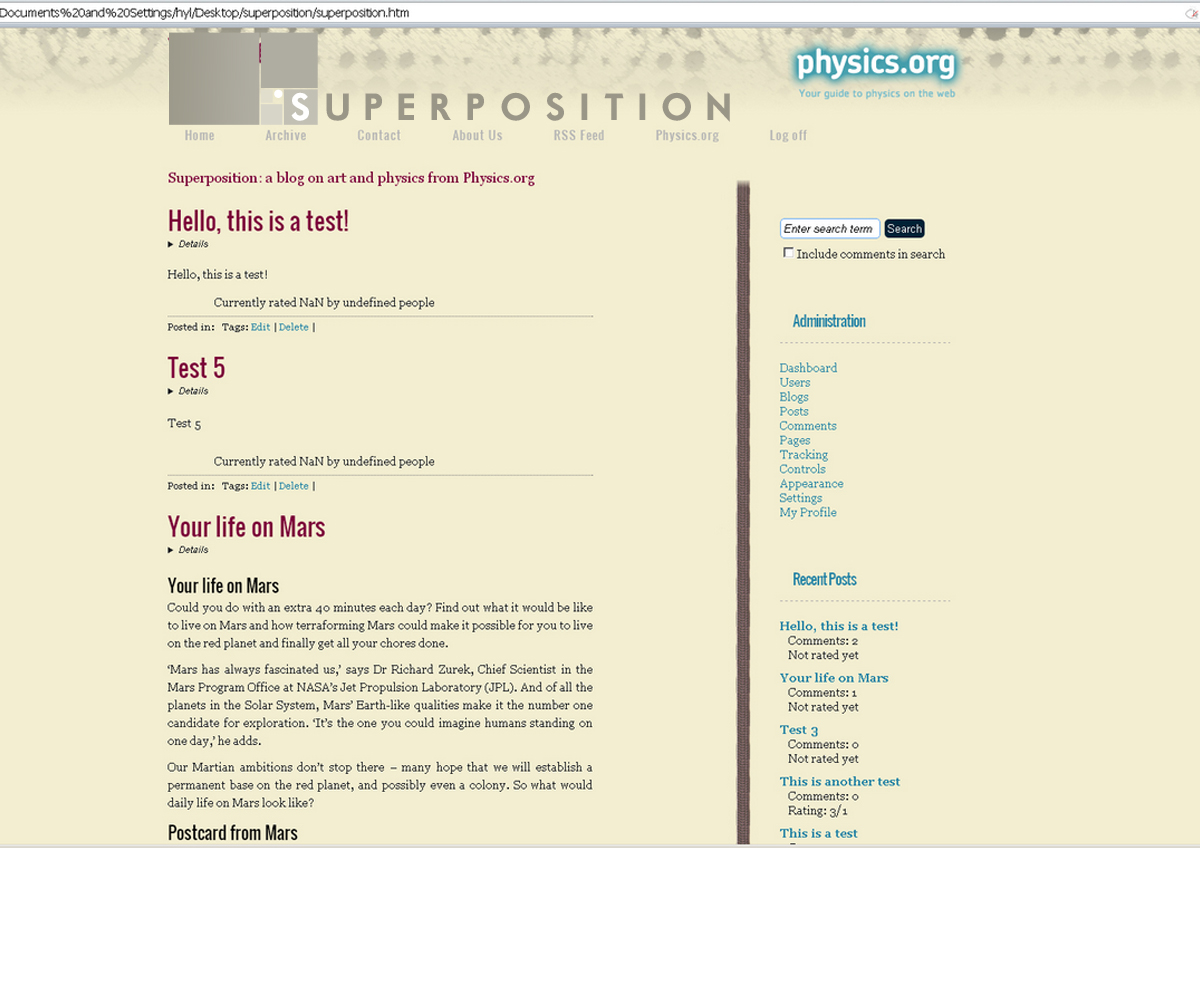
The web logo will sit across from the physics.org logo on the grey dotted background, so must be complimentary to the branding. Physics.org is a part of the Institute of Physics, so this new logo should sit comfortably along side both brands.
The colour should fit in with the cream, grey and burgundy pallet of the blog:
Cream: #f3eed1
Grey: #b2afa3
Burgundy: #7d003b
Darker grey: #4f4d4a
Blue: #2483A6
We have attached some samples for guidance, but please do not feel limited by theses. They should serve as jumping off points and we would like to see what you come up with. The theme should revolve around merging, blurring, and bringing two unlike things together with unexpected results. Do get in touch if you have any questions.
Actualizaciones
Hi everyone,
Best wishes,
Added Thursday, February 14, 2013
Objetivo del mercado(s)
Young professionals with an active interest in contemporary culture and the arts.
Texto del logo
Superposition
Estilos de logo de interés
Logo con emblema
Logo contenido dentro una forma / figura
Logo pictórico / combinado
Un objeto del mundo real (texto opcional)
Logo abstracto
Conceptual / simbólico (texto opcional)
Logo de marca de nombre
Logotipo basado en palabra o nombre (solo texto)
Mira y siente
Cada control deslizante ilustra las características de la marca del cliente y el estilo que debe comunicar el diseño de tu logotipo.
Elegante
Atrevido
Juguetón
Serio
Tradicional
Moderno
Atractivo
Profesional
Femenino
Masculino
Vistoso
Conservador
Económico
De Alta Gama
Requisitos
Debes tener
- The text: Superposition
We will need print and web versions of this logo in monochrome, full colour and white out versions.
We will need raw design files delivered at the end of the project.
Agradable de tener
- Please have a look at attached examples.
Would be nice to see beautiful physics concepts or images. Particle tracks are always nice:
http://www.universetoday.com/58521/cloud-chamber/
Stars, mirrors and prisms also have physics elements that can be beautiful.
No debería tener
- Avoid physics stereotypes: crazy hair, big glasses, lab coats.
Again, this needs to appeal to people with an interest in art first.