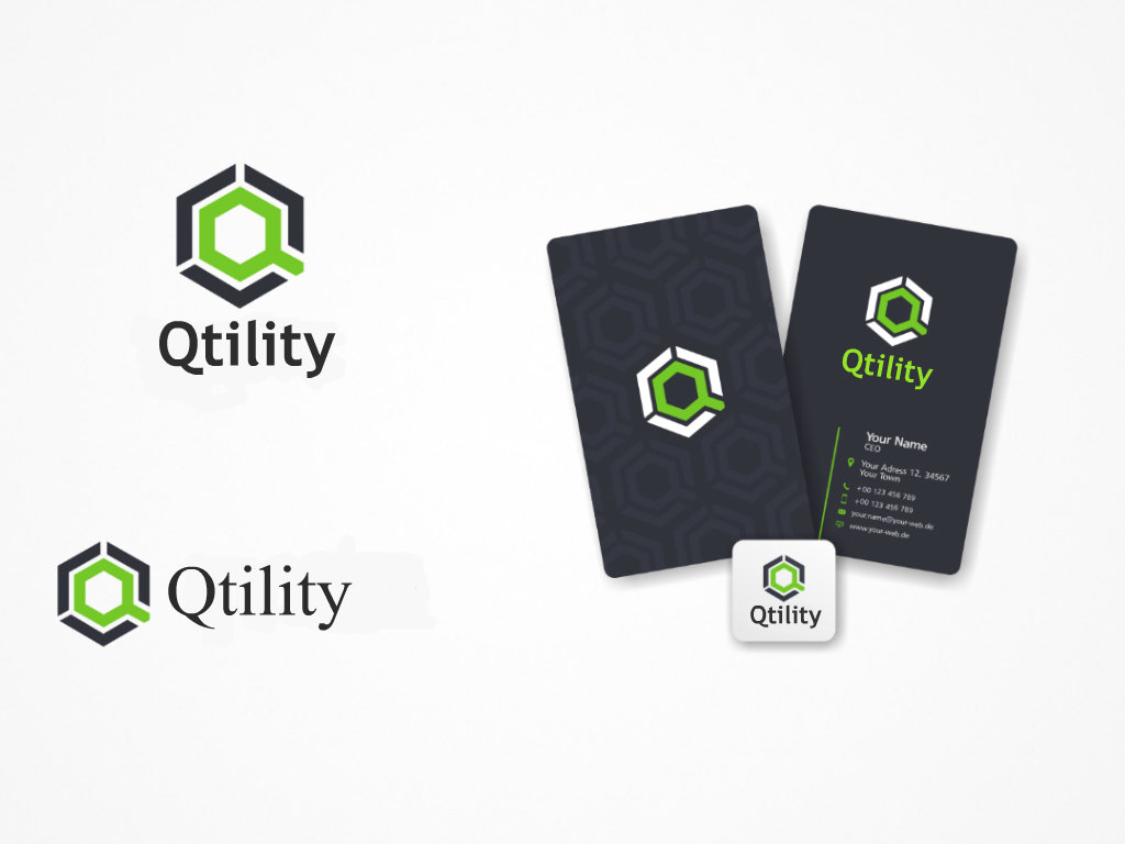
Qtility - New Logo for File-sharing Software Company
¿Quieres ganar un trabajo como este?
Este cliente recibió 76 diseños de logo de 29 diseñadores. Eligieron este diseño de logo de V-Art-Works como el diseño ganador.
Únete gratis Encuentra trabajos de diseño- Garantía
-
 US$170
-
 76 diseños
-
 29 diseñadores
Resumen de Diseño de Logo
Our Industry: Software.
Our Business: Qtility software solutions enable real time data integration and migration in Enterprise, Cloud and Hybrid configurations. Moving data and files into and out of cloud and enterprise ECM systems is fast, cost-effective, trackable and secure. (Think, Dropbox for businesses that have complex file-systems)
A few Competitors: www.jitterbit.com - www.bluefishgroup.com - www.trinitytechnologies.com
Target Audience:
- Predominantly Male, 30-50 years old, international
- Managers looking to solve business problems.
- Occasionally programers and technical minds researching solutions for their data migration roadblocks.
Feeling/message logo should convey: Powerful, confidence, technology, integration, data migration.
Potential Elements in Logo: Possibly gears (to convey the integration our software handles, between different systems, such as ECM & Cloud). Possibly multi-directional arrows infering the transfer of data up & down from the cloud. Please keep all graphic elements away from the right side of the logo, so we can add additional text to the right of the word Qtility (see below in "Text in Logo" section).
Text in Logo: Qtility
(note: Qtility is our company name and the text in the main logo. Then we have various tools/software under the Qtility umbrella that we would like to append to "Qtility"....for example: "Qtility MOVE" software. For this we would imagine the word MOVE in the same font as the logo, but a different color. This is secondary, but something to keep in mind when placing any graphics/etc, please keep them on the left side of the logo or really anywhere except the right side)
Colors: We are open, but more powerful/subtle colors. Not too flashy and/or cartoonish.
Fonts: Please use fonts that you can deliver the files to us with the final product, so that we can modify/append our software titles as we launch new products.
Logos we admire:
http://www.jitterbit.com/wp-content/uploads/2013/04/logo.png (they are a direct competitor, so we want to be careful not to land too close to their design)
http://www.mclarensoftware.com/media/243607/mclaren-idox_home_page.png (like the honeycomb idea with data moving across the "web", but feel the web graphic doesn't feel integrated with the text. they are also a direct competitor so we want to be careful not to land too close to their design)
Shift - http://www.HoneyTrek.com/si/ShiftLogo.png
Sun - http://www.HoneyTrek.com/si/SunLogo.png
Objetivo del mercado(s)
Common Industries using our software: Engineering firms, Oil & Gas companies, Government organizations, other large corporations.
Tipo de industria / entidad
Software
Texto del logo
Qtility
Estilos de logo de interés
Logo pictórico / combinado
Un objeto del mundo real (texto opcional)
Logo de marca de nombre
Logotipo basado en palabra o nombre (solo texto)
Estilos de fuente para usar
Mira y siente
Cada control deslizante ilustra las características de la marca del cliente y el estilo que debe comunicar el diseño de tu logotipo.