Jodhi Photography Studios Logo Contest - Guaranteed Payment & Add On Work Possible
¿Quieres ganar un trabajo como este?
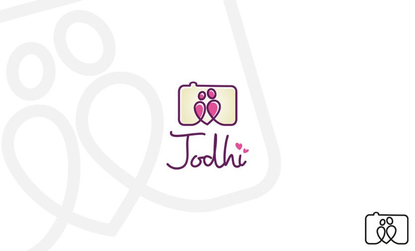
Este cliente recibió 120 diseños de logo de 46 diseñadores. Eligieron este diseño de logo de Omee como el diseño ganador.
Únete gratis Encuentra trabajos de diseño- Garantía
-
 US$200
-
 120 diseños
-
 46 diseñadores
Resumen de Diseño de Logo
We're looking for a design for a new photography studio that will be called Jodhi.
JoDhi is a portmanteau (combination.. Jo + Dhi) of part of the last names of the two proprietors of the photography studio.
Jodhi also means 'couple' in Hindi (the Indian language).
Jodhi would focus on unique end to end creative photography and video projects but primarily focus on weddings, portraiture, event photography.
Actualizaciones
Project Deadline Extended
Reason: Hey guys,
We are extending the deadline because I don't there there has been enough time for you guys to work nor has there been enough time for us to provide feedback. Thanks!
Added Friday, February 08, 2013
Objetivo del mercado(s)
End users, consumers, couples.
Tipo de industria / entidad
Event
Texto del logo
Jodhi
Estilos de logo de interés
Logo pictórico / combinado
Un objeto del mundo real (texto opcional)
Logo de marca de nombre
Logotipo basado en palabra o nombre (solo texto)
Logo con siglas
Acrónimo o logo tipográfico (solo texto)
Mira y siente
Cada control deslizante ilustra las características de la marca del cliente y el estilo que debe comunicar el diseño de tu logotipo.
Elegante
Atrevido
Juguetón
Serio
Tradicional
Moderno
Atractivo
Profesional
Femenino
Masculino
Vistoso
Conservador
Económico
De Alta Gama
Requisitos
Debes tener
- After seeing some designs... I 'd like to highlight that we are looking for something simple and elegant. Should be 1 or 2 colours (thus being simple).
Avoid using fonts as is... I'm looking for something creativity and free hand but clean. Same goes with any lines/curves that are added. Freehand is better... and they shouldn't be too prominent or distracting.
Agradable de tener
- A hint of Indian would be nice, but it's not necessary and definitely should not over power the elegance of the logo. The logo should look good as a watermark. The logo should look good on business cards, social media, stationary (tshirts etc).
No debería tener
- Nothing too busy. Not "clip art" type icons added. No hearts (that's tacky). No Hindi style fonts (that's over done).
Avoid using fonts as is... I'm looking for something creativity and free hand but clean. Same goes with any lines/curves that are added. Freehand is better... and they shouldn't be too prominent or distracting.