

 Refresh
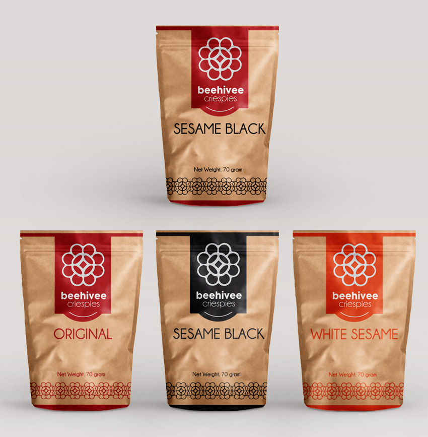
beehivee crispies snack packaging
¿Quieres ganar un trabajo como este?
Este cliente recibió 35 diseños de empaque de 8 diseñadores. Eligieron este diseño de empaque de ordelya.nicole como el diseño ganador.
Únete gratis Encuentra trabajos de diseño
- Garantía
-
 €170
€170
-
 35 diseños
-
 8 diseñadores
Resumen de Diseño de Empaque
We are a new startup snack company that need a design for a snack packaging. Our snack goes by the name of beehivee crispies. Its a traditional snack usually eaten during festive seasons in south east asia region. The idea is to revolutionize the notion of the snack from one that is eaten during these celebratory seasons to an everyday one. The packaging design should be modern and minimalist yet fun too, also taking into consideration that it should not appear to be too childish. It should stand out from the other snacks products like potato chips etc if placed on the same shelf. The colour scheme is not decided yet as we are open to more ideas but colours should be complementary and not more than 2 or 3 hopefully. There should be also be an enthic sense of south east asian features on the design and it should reflects the Chinese, Malay and indian heritage. It need not be too obvious, a subtle kind should suffice. The packaging should also have the particular graphic/shape of the mould that i have upload followed by the picture of the snack. I have included a mock up of the logo of my company. Proposed designs can feel free to alter the beehivee graphic to a more modern, minimalist yet whimsical and fun. Proposed designs should have a front and back view of the packaging. We are looking to launch at 4 to 5 flavours like white sesame, black sesame, peanuts with white sesame and original.

Actualizaciones
Project Deadline Extended
Reason: Not enough submissions coming in yet.
Added Monday, March 23, 2015
Project Deadline Extended
Reason: Extension of deadline to allow more designs to come in.
Added Wednesday, April 1, 2015
Objetivo del mercado(s)
All ages from as young as 5 to 6 years old to 60 to 70s.
Tipo de industria / entidad
It Company
Estilos de fuente para usar
Gustan otros estilos de fuente:
- Fonts should be simple and minimalist. Easy for elderly to read without straining the eyes.
Mira y siente
Cada control deslizante ilustra las características de la marca del cliente y el estilo que debe comunicar el diseño de tu logotipo.
Elegante
Atrevido
Juguetón
Serio
Tradicional
Moderno
Atractivo
Profesional
Femenino
Masculino
Vistoso
Conservador
Económico
De Alta Gama
Requisitos
Debes tener
- My logo which I have designed. Designers can feel free to tweak and enhance the design of the logo. The colour is not definite yet. Consumers must know what
- we are selling from the design of the packaging without guessing how it look
- like. The suggested packaging dimension is 17cm (W) by 23.5cm (H).
Agradable de tener
- We are looking to print the package using kraft paper which I have attached.
No debería tener
- religious inclination of motifs, logo etc.


