Phase 3 HI-TEC Footwear Icon Set Design - Gender and Other Designs
¿Quieres ganar un trabajo como este?
Este cliente recibió 9 diseños de ícono de 4 diseñadores. Eligieron este diseño con ícono de Synco Creative Direction como el diseño ganador.
Únete gratis Encuentra trabajos de diseño- Garantía
-
 £380
£380
-
 9 diseños
-
 4 diseñadores
Resumen de Diseño Con Ícono
![]()
HI-TEC, a global footwear company, requires a further 6 icon designs to add to the 3 they purchased in the HI-TEC Icon Set Design Phase 1 contest and the 22 footshape icons they are requesting within their Phase 2 icon design contest. This is phase 3 of HI-TEC''s Icon Set Design project.
HI-TEC would like a further 6 icon designs including 1 technology icon and 5 feature icons (see below for descriptions). These icons should utilise the style of phase 1 designs (see below and attached templates) but should not use a footshape as with phase 2.
Technology Icon x 1
Technology icons have a basic grey circle (including the icon) and some
text of the technology name in an encapsulated, rounded rectangle (as
per XcM and Winter Traction example icons below).
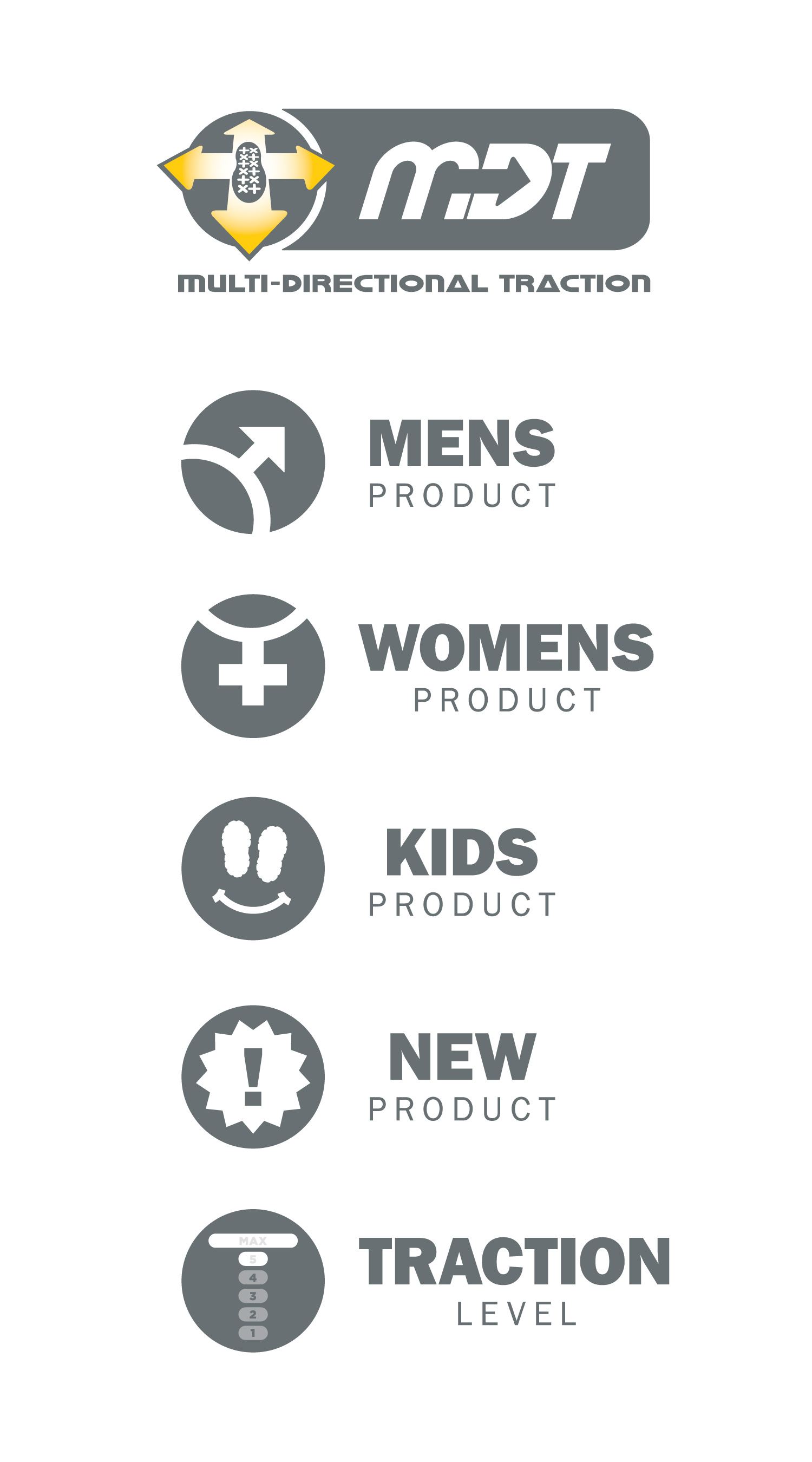
Description: Multi-directional traction. Logo existing. Need to incorporate this into the same shape/format as the others.
Design direction: Car tyre or shoe outsole tread signifying grip in different directions through use of arrows?
Feature Icons x 5
Overview: Adjustable icon to highlight level of traction a product offers. 0 to 5 scale.
Design direction: Car tyre or treadmark with something to indicate level (e.g. "x5" in a little circle / bubble)
Overview: Product for men
Design direction: open to designers ...
Overview: Product for men
Design direction: open to designers ...
Overview: Product for men
Design direction: open to designers ...
Overview: Icon to highlight that a product is new to the range
Design direction: open to designers ...
These icons should conform to the style / template created by phase 1. Consistency is very important.
Technology Icon Examples / Style from Phase 1

Feature Icon Style / Example from Phase 1

Please note:
do not have to include the text for each icon in this phase when you
submit, but it will help if you do. If you do choose to add the
feature/technology names to the icons, you must use the fonts as per
phase 1 (see Nice to Have requirements below)
For this phase, in addition to the colour grey, you may use 1 extra colour to
highlight the specific feature or technology. For example, for toe
protection, you may use a yellow rectangle over the toe part of the
foot to highlight that is the focus of the feature. The colour and
application is up to you.
If you were not involved in Phase 1 of this project, please see the attached brief HI-TEC Icon Set Design Phase 1 contest on DesignBay for further explanation of how technology icons and feature icons differ.
Tipo de industria / entidad
Footwear
Texto del logo
N/A
Requisitos
Debes tener
- The styles and colours as per the templates. There are two styles - one for technology icons and one for feature icons
- Make the primary color of the icon white and make it connect or touch with the circle
- Use a single colour to highlight part of the foot that is relevant to each feature or technology
- The ability to use any of the icons in greyscale/monotone only. Any color highlights should have a monotone/B&W version.
Agradable de tener
- (Note: these requirements are not compulsory)
- The text of the feature /
- technology nameto the right of the main icon (if you have the fonts).
- This is not compulsory. i.e. you can still submit if you don''t have
- the fonts, although it would help as names can be applied in different
- ways.
- The correct fonts when you apply the text:
No debería tener
- Clipart, stock or copied intellectual property
- Different fonts to those specified (if you do not have the fonts, leave the text out)