Logo for Horse Racing Company
Somerset Racing necesitaba un logo design y recibió 22 Conservative logo designs de 4 diseñadores
Diseños
Diseñadores
Presupuesto


1 - 20 de 22 diseños de logo propuestas
Esto es lo que Somerset Racing buscaba en su logo design
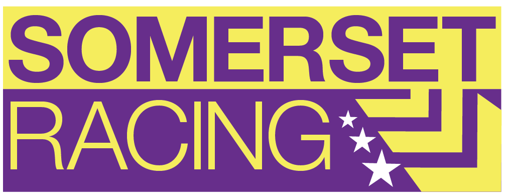
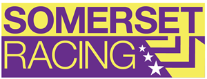
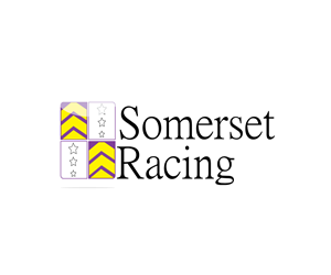
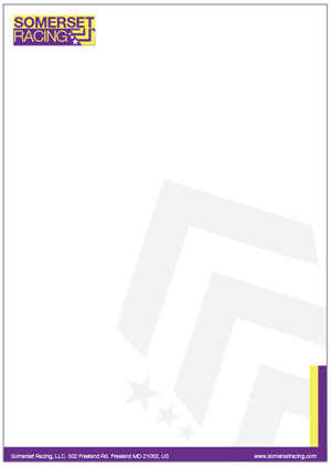
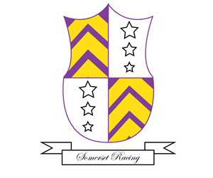
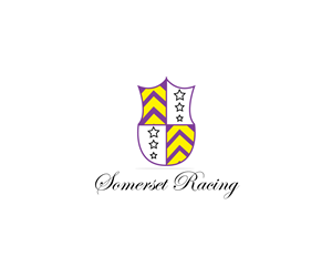
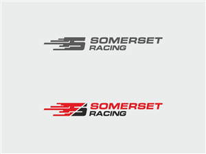
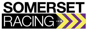
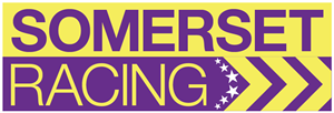
A logo to replace the current logo at http://www.somersetracing.com, which I do not feel goes with the overall corporate image, and does not incorporate our silks colors and design.
The silks colors and design are very important in horse racing - they are actually what people recognize, so a logo should be based upon them. The logo does not actually have to BE the silks, but some design which would make it obvious to someone who knew what your silks look like that the logo is yours.
I would suggest it just be a square with the silk colors and motifs, with "Somerset Racing" next to it, but I am open to other ideas. Also should not use the current font, which is too "sci fi" to me. A conservative Sans Serif font would be my suggestion.
Leer más