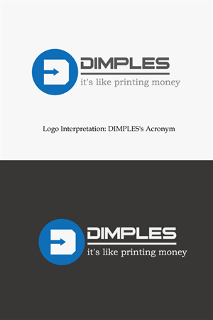
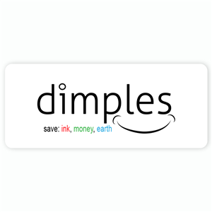
Logo for Dimples ink-saving fonts
dimples (or Dimples or DIMPLES, etc.) necesitaba un logo design y recibió 55 Atrevido, Profesional, Software logo designs de 22 diseñadores
Diseños
Diseñadores
Presupuesto


1 - 20 de 55 diseños de logo propuestas
Esto es lo que dimples (or Dimples or DIMPLES, etc.) buscaba en su logo design
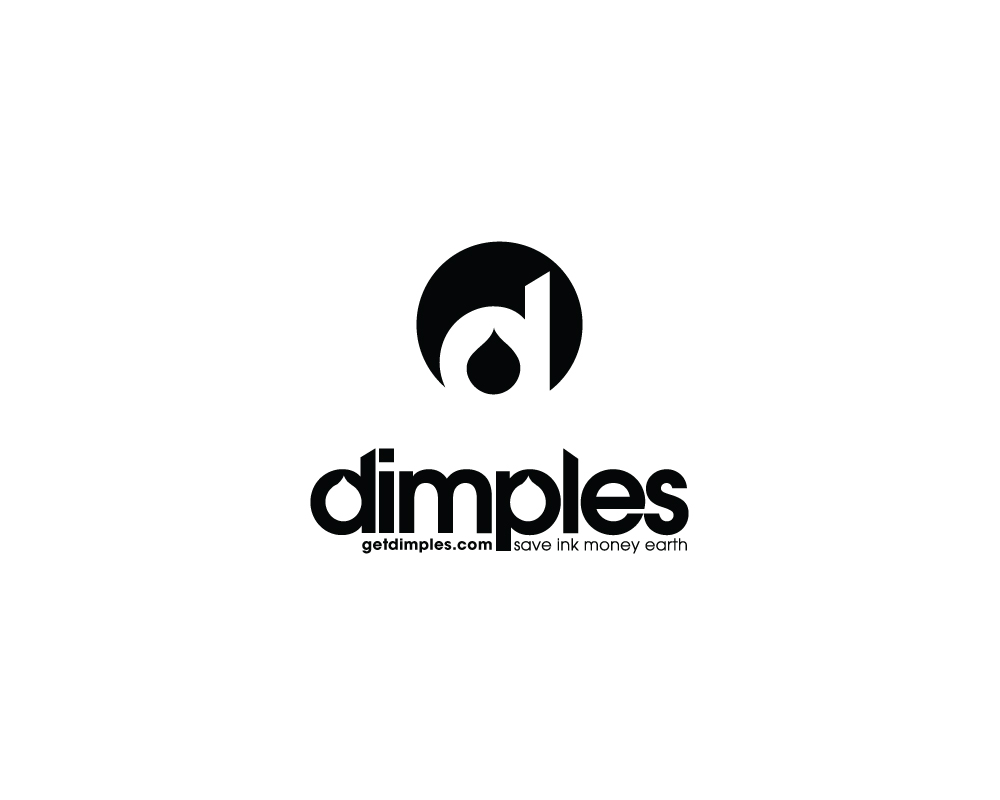
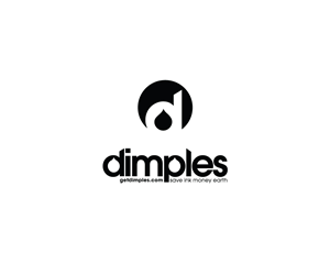
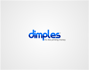
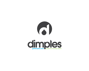
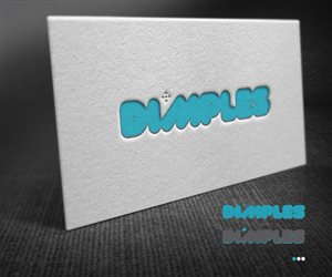
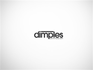
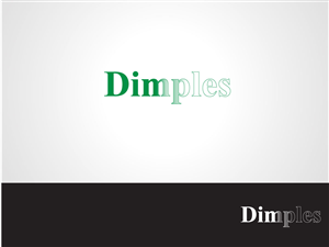
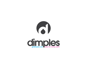
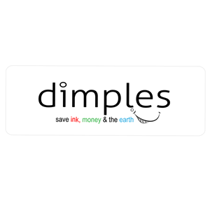
Dimples (http://GetDimples.com) is a company that makes ink-saving fonts and software using tiny perforations (hence 'dimples') to form negative spaces inside printed text. As part of our company re-branding, with the logo we're aiming for these goals:
CLEAR as in legible- so the font should be very readable, crisp.
EASY, user-friendly- so it shouldn't look too complicated.
FUN, as in a bit different, so there should be personality.
PROFESSIONAL, since our target market is company execs and administrators.
DIMPLED, conveying that we 'dimple' text.
USEFUL - so the value should be immediately apparent (something encapsulating saving money, environment, ink).
As taglines, we've been using 'save ink money earth' and/or 'it's like printing money'.
We really like clever use of typography and simple shapes.
We've included our own (failed) logo ideas and an enlarged sample of our "dimpled" fonts. You can check our website (above) for…
Leer más