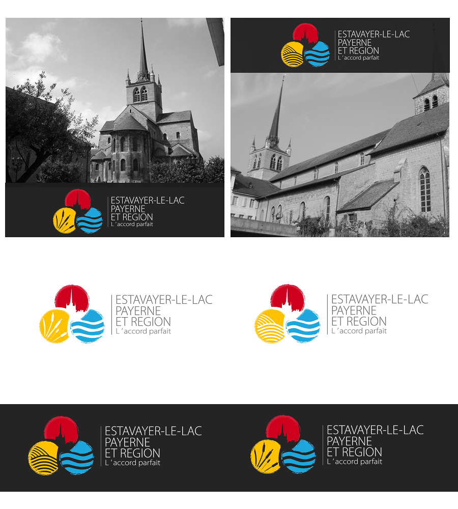
Payerne Estavayer v2

¿Quieres ganar un trabajo como este?
Este cliente recibió 60 diseños de logo de 33 diseñadores. Eligieron este diseño de logo de Kolor como el diseño ganador.
Únete gratis Encuentra trabajos de diseño- Garantía
Resumen de Diseño de Logo
I need a vectorised finalised version of this logo sketch, sticking very closely to this design but with two changes: the three colours to use for the spheres are red, yellow and blue; and the yellow sphere should be reworked with two options - one with reeds/bulrushes, and one with the furrows of a ploughed field.
The vertical line between the logo and text should not be too thick.
Overall the aim is to produce a usable finished logo, but keeping the dynamism of the original sketch.
The building in the red sphere is the Abbatiale in the town of Payerne, with its distinctive tower shape.
Objetivo del mercado(s)
tourists, local residents, daytrippers. Used for signage etc as well as stationery and marketing
Tipo de industria / entidad
Building
Texto del logo
exactly what it says on the sketch (there is an apostrophe in "l'accord parfait" which isn't clear
Mira y siente
Cada control deslizante ilustra las características de la marca del cliente y el estilo que debe comunicar el diseño de tu logotipo.
Elegante
Atrevido
Juguetón
Serio
Tradicional
Moderno
Atractivo
Profesional
Femenino
Masculino
Vistoso
Conservador
Económico
De Alta Gama
Requisitos
Debes tener
- Close relationship to the sketch. Interlinked spheres as in sketch, relationship between graphic and text elements as in sketch. Two options, one with reeds/bulrushes, the other with ploughed furrows. Abbatiale in red sphere. Yellow instead of green.
No debería tener
- Not too stiff or formal. Should not look too municipal in its treatment.