EcoPacific+, international conservation organization seeks to redesign its logo
¿Quieres ganar un trabajo como este?
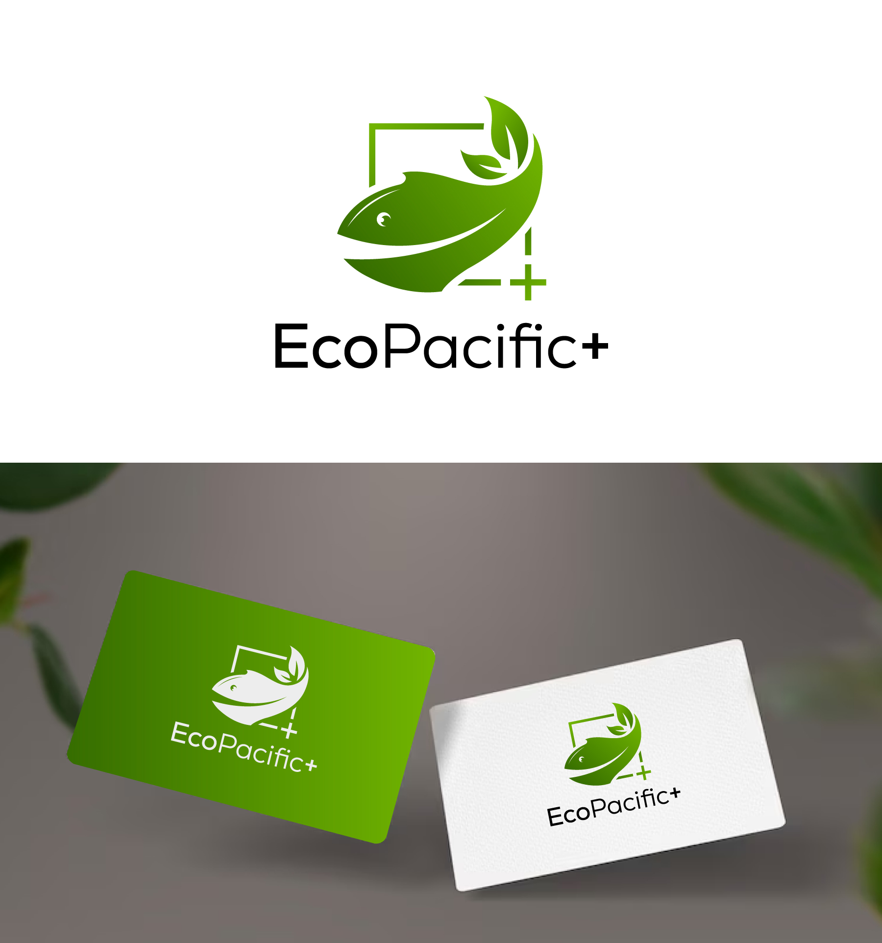
Este cliente recibió 165 diseños de logo de 94 diseñadores. Eligieron este diseño de logo de debdesign como el diseño ganador.
Únete gratis Encuentra trabajos de diseño- Garantía
-
 US$150
-
 165 diseños
-
 94 diseñadores
Resumen de Diseño de Logo
We are a small group of professionals but with great impact on the sea and its resources. For example, we have trained more than 600 fishermen in several countries to treat turtles that get hooked with good techniques, we have developed projects for the sustainability of fishing, we seek to integrate all actors from the fisherman to the final consumer of fish.
We have two logos, one homemade, which was the first one we made, and another more elaborate one. The idea behind the logo is that We call ourselves EcoPacific+ because we work with an ecosystem approach mainly in the Pacific of Latin America but we go beyond, that's why we use the symbol +. We use colors from the ocean but also from nature. We use EcoPacific in English and EcoPacifico in Spanish so it is easy to switch from one language to the another and the logo design can play around with the "o" at the end.
We seek to merge the logos into a single logo, simple, bold, although the word is long, and a graphic that can be recognized with or without text. Current logos are attached.
Our target audience includes NGOs, Government, fishing sectors and international donors. The logo will be used on social media, website, materials and also for printing on T-shirts and other items. Also, attached you may find some logos as a reference
Objetivo del mercado(s)
NGOs, Government, fishing sectors and international donors
Texto del logo
EcoPacific+
Estilos de logo de interés
Logo abstracto
Conceptual / simbólico (texto opcional)
Mira y siente
Cada control deslizante ilustra las características de la marca del cliente y el estilo que debe comunicar el diseño de tu logotipo.