EcoPacific+, international conservation organization seeks to redesign its logo
EcoPacific+ necesitaba un logo design y recibió 77 Moderno, Masculino logo designs de 52 diseñadores
Diseños
Diseñadores
Presupuesto


1 - 20 de 77 diseños de logo propuestas
Esto es lo que EcoPacific+ buscaba en su logo design
We are a small group of professionals but with great impact on the sea and its resources. For example, we have trained more than 600 fishermen in several countries to treat turtles that get hooked with good techniques, we have developed projects for the sustainability of fishing, we seek to integrate all actors from the fisherman to the final consumer of fish.
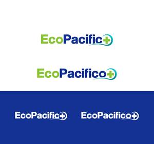
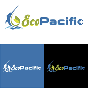
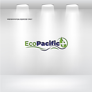
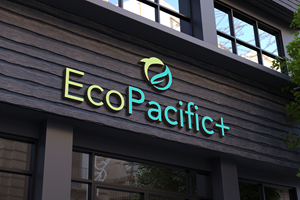
We have two logos, one homemade, which was the first one we made, and another more elaborate one. The idea behind the logo is that We call ourselves EcoPacific+ because we work with an ecosystem approach mainly in the Pacific of Latin America but we go beyond, that's why we use the symbol +. We use colors from the ocean but also from nature. We use EcoPacific in English and EcoPacifico in Spanish so it is easy to switch from one language to the another and the logo design can play around with the "o" at the end.
We seek to merge the logos into a single logo, simple, bold, although the word is long, and a graphic that can…
Leer más