Design a logo for an exciting ecommerce launch
¿Quieres ganar un trabajo como este?
Este cliente recibió 182 diseños de logo de 75 diseñadores. Eligieron este diseño de logo de The Lion Studios como el diseño ganador.
Únete gratis Encuentra trabajos de diseño-
 £110
£110
-
 182 diseños
-
 75 diseñadores
Resumen de Diseño de Logo
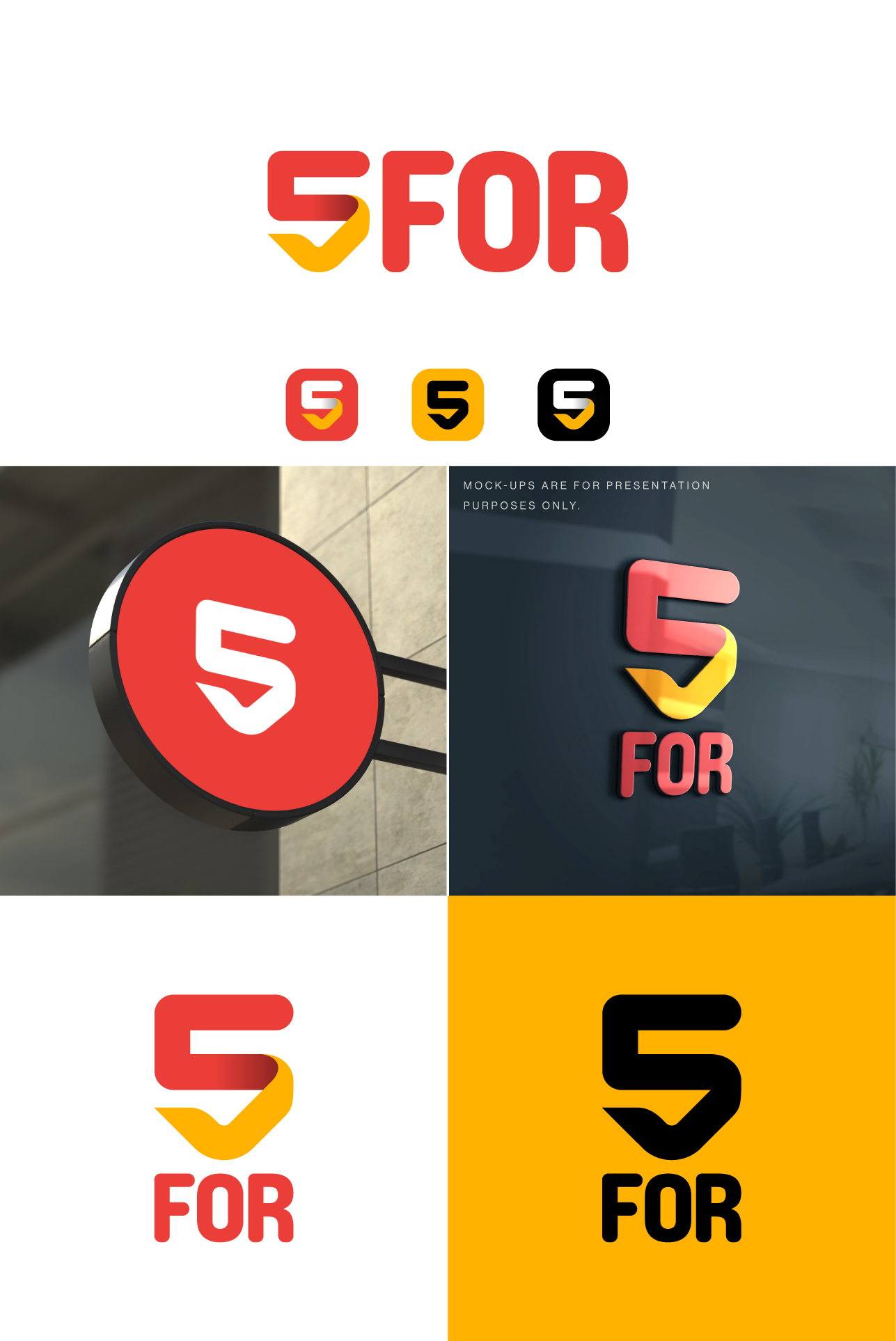
5FOR is a soon-to-launch e-commerce company that will review products for specific audiences e.g. 5 mobiles for seniors. 5 great chairs for gamers etc. Our reviews will offer more entertainment value and separate us from more functional review sites.
We’d like a logo that symbolises the spirit of 5FOR.
We’re not high-end luxury. We’re not flea market hawkers. We’re somewhere in the middle and we’re building a site where everyone should have a good time and if we’re lucky, a few of them might buy a lamp.
We’re not ostentatious or pretentious. We’re grounded and down to earth.
We’re friendly. Not corporate friendly. Friend friendly.
Our design should feel smart but not smug.
We’d like to avoid cartoon characters, and cliched e-commerce iconography.
It should be at least 30% better than the Nike Swoosh.
We’re open to suggestions on colour palettes but have attached one example that we quite like.
Holler if you have any questions.
And thank you.
Objetivo del mercado(s)
18+ online value shoppers
Tipo de industria / entidad
ecommerce
Texto del logo
5FOR
Estilos de logo de interés
Logo con emblema
Logo contenido dentro una forma / figura
Logo abstracto
Conceptual / simbólico (texto opcional)
Logo de marca de nombre
Logotipo basado en palabra o nombre (solo texto)
Estilos de fuente para usar
Mira y siente
Cada control deslizante ilustra las características de la marca del cliente y el estilo que debe comunicar el diseño de tu logotipo.
Elegante
Atrevido
Juguetón
Serio
Tradicional
Moderno
Atractivo
Profesional
Femenino
Masculino
Vistoso
Conservador
Económico
De Alta Gama
Requisitos
Debes tener
- Our design should feel smart but not smug. Logo should feel original but not trying too hard. More ebay and Google than Tesla and Oracle.
Agradable de tener
- Works well in horizontal and vertical orientation. Should also read well as an app icon.
No debería tener
- We’d like to avoid cartoon characters, and cliched e-commerce iconography. Open to other logo styles.