Visual Identity for Betty Independent Group – Empowering Independence
¿Quieres ganar un trabajo como este?
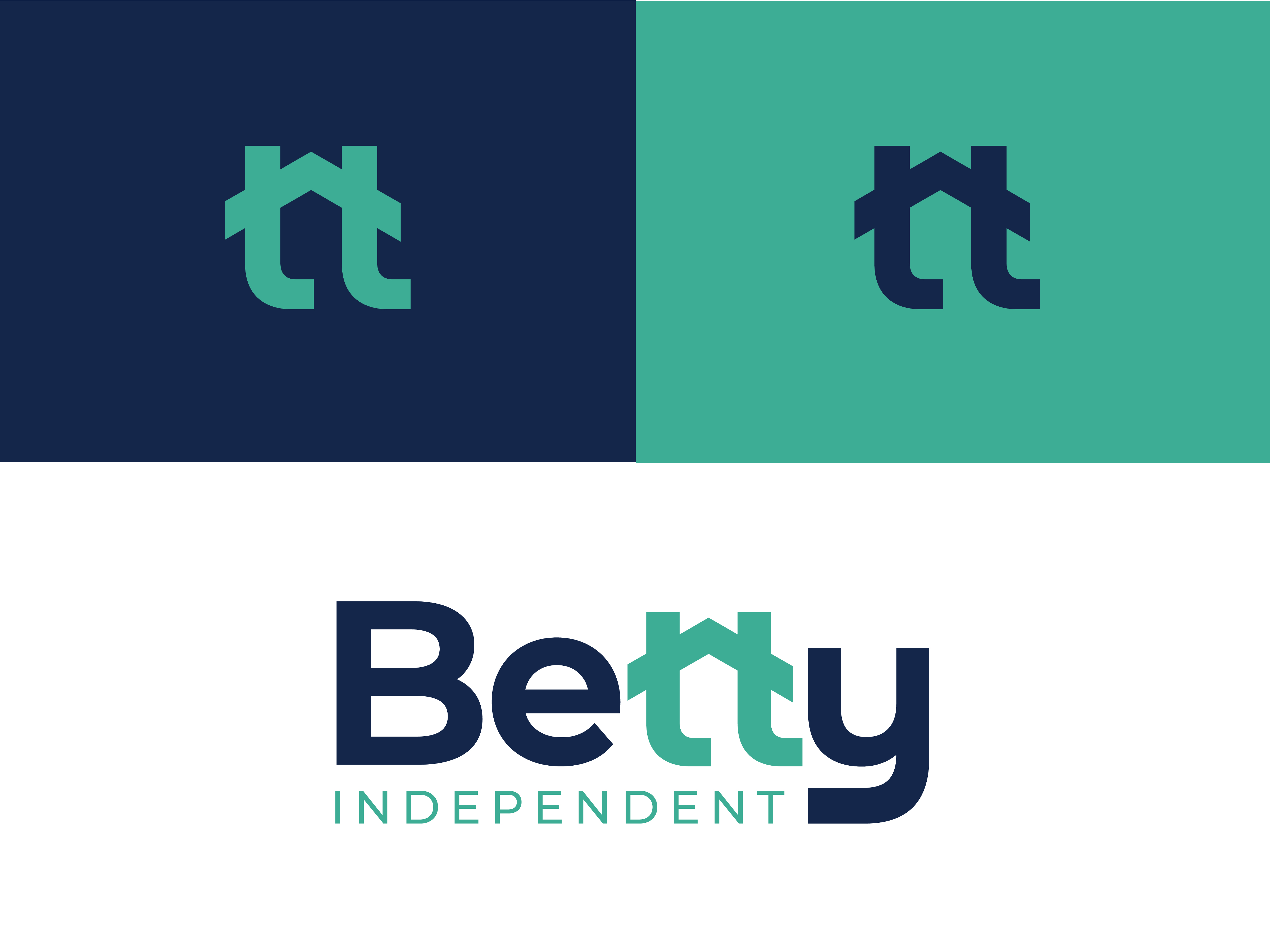
Este cliente recibió 240 diseños de logo de 106 diseñadores. Eligieron este diseño de logo de Emjey como el diseño ganador.
Únete gratis Encuentra trabajos de diseño- Garantía
-
 A$250
A$250
-
 240 diseños
-
 106 diseñadores
Resumen de Diseño de Logo
Non-negotiables
Professional but approachable – Logo must clearly signal trust, care, and professionalism in the aged care / community support sector. No cartoonish or gimmicky styles.
Readable at all scales – Must work on business cards, stationery, websites, and uniforms without losing legibility.
Clean, modern typography – Sans-serif or humanist fonts that feel warm but professional. Avoid overly decorative fonts.
Colour direction – Palette should lean towards calm, supportive tones (e.g. teal, navy, green) rather than harsh primaries or neon.
Nice-to-haves
Symbolic element – A subtle icon that suggests independence, community, or support (e.g. abstract figure, circle motif, linked shapes).
Future-proofing – Flexible enough to expand into related services (disability, aged care, respite) without looking locked to one niche.
Optional tagline space – Leave room for a short phrase if we choose to add one later.
Guidance for designers
Off-brief entries (e.g. corporate tech vibes, childish graphics, overly medical/hospital logos) will be declined immediately.
We value quality and alignment over sheer quantity. Please don’t submit dozens of minor variations—refinements should only be made after feedback.
Designs should feel Australian professional services sector-appropriate, not generic stock icons.
Company Name: Betty Independent Group Pty Ltd
Industry: Aged Care and Disability Support
We help people live independently with the right care and support. The brand should feel trustworthy, approachable and human, but also professional enough to sit next to government and corporate paperwork.
Style :
Modern, clean and memorable
Warm and uplifting (not clinical or cold)
Open to icons, abstract shapes, or simple wordmark styles
Colours (suggestions, not rules):
Must work in colour and black & white
Navy or teal as a strong base
Softer accents like green, purple or aqua
Avoid loud/neon tones
Ideas (but not locked in):
Shapes that show care or connection (circles, petals, hands)
Something that feels supportive, stable and independent
Could be text-only if the typography is strong and unique
Where it will be used:
Invoices, policies, reports
Website and email signature
Staff shirts and uniforms
Marketing material down the track
We want a design that feels like it belongs in both professional and community spaces — credible for audits, but still friendly for families and participants.
Tipo de industria / entidad
Disability Support and Care, Aged Care Social Work
Texto del logo
Betty Independent / Betty Independent Group Pty Ltd / Open to Ideas
Estilos de logo de interés
Logo abstracto
Conceptual / simbólico (texto opcional)
Logo de marca de nombre
Logotipo basado en palabra o nombre (solo texto)
Logo con siglas
Acrónimo o logo tipográfico (solo texto)
Estilos de fuente para usar
Gustan otros estilos de fuente:
- Open to suggestions
Colores
Diseñador para elegir los colores que se utilizarán en el diseño.
Mira y siente
Cada control deslizante ilustra las características de la marca del cliente y el estilo que debe comunicar el diseño de tu logotipo.
Elegante
Atrevido
Juguetón
Serio
Tradicional
Moderno
Atractivo
Profesional
Femenino
Masculino
Vistoso
Conservador
Económico
De Alta Gama
Requisitos
Debes tener
- Professional but approachable – Logo must clearly signal trust, care, and professionalism in the aged care / community support sector. No cartoonish or gimmicky styles. Readable at all scales – Must work on business cards, stationery, websites, and uniforms without losing legibility. Clean, modern typography – Sans-serif or humanist fonts that feel warm but professional. Avoid overly decorative fonts. Colour direction – Palette should lean towards calm, supportive tones (e.g. teal, navy, green) rather than harsh primaries or neon.
Agradable de tener
- Symbolic element – A subtle icon that suggests independence, community, or support (e.g. abstract figure, circle motif, linked shapes). Future-proofing – Flexible enough to expand into related services (disability, aged care, respite) without looking locked to one niche. Optional tagline space – Leave room for a short phrase if we choose to add one later.