

 Refresh
UpDownForward.com - Human Behavior + Personal Develpment Tools & Coaching
¿Quieres ganar un trabajo como este?
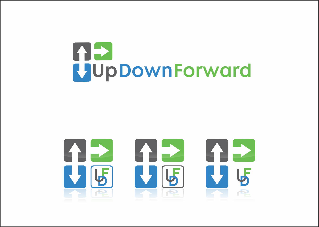
Este cliente recibió 139 diseños de logo de 31 diseñadores. Eligieron este diseño de logo de SEOanalyst como el diseño ganador.
Únete gratis Encuentra trabajos de diseño
- Garantía
-
 US$200
-
 139 diseños
-
 31 diseñadores
Resumen de Diseño de Logo
Looking for a modern, professional & fun logo that captures the essence of personal development and behavior change. Sometimes there are areas where we want to increase a certain metric; sometimes decrease.
Website will have 3 components: Blog/Newsletter, App, & Coaching.
Am partial to grey + blue colors (kind of like DesignCrowd logo) but am flexible. Would like to somehow have a logo that conveys the directionality of the words. Current logo but am completely open for ideas as to the best way to accomplish this. Took a stab at it myself with my current logo but got slammed in usability tests for being too difficult to read.

Actualizaciones
| One thing to keep in mind as you submit your design: It is my preference to have one unitary logo that integrates seamlessly with the words (UpDownForward) as opposed to say a logo/image off to the left with words beside on the right. I''m looking for creative ways to combine words+image into one single message that drives the point home without forcing the users to have to think twice (once to process the image and once to process the words). |
| What I Have Liked Most: - Darker/bolder colors in the grey/blue hues vs lighter - Proper Noun Capitalization (vs all lower or UPPER case) - Sleek and elegant fonts (sans-serif) - Creative use of arrows incorporated into or around the letter/word design - A few of the best designs I''ve seen so far created 2 versions of the logo. One with just the words and another above with just a creative use of the initials UDF - There are a few exceptions, but in general, I''ve liked the ones with 2 different colors vs 3 What I Have Liked Least: - Embedding arrows inside of the spaces of letters like ''O'' ''D'' ''P'' - Big blocky letters (usually due to being all caps) - Letters of words too cramped together - Small little icons at the beginning of the words ''UpDownForward''...not interested. Am looking for something integrative not two separate entities - Only 1 color or different shades of the same color Thank you again for your interest and submissions. While I have certainly seen some pretty great submissions; I've yet to see something that I'm 100% sold on as of yet...so please feel free to take the feedback above and continue to experiment. I promise to take care and provide feedback on every one. All the best, Jason By You |
Added Thursday, April 24, 2014
Tipo de industria / entidad
It Professional
Texto del logo
Up Down Forward (with or without spaces | with or without .com)
