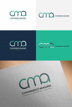
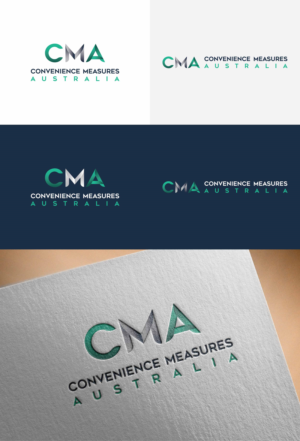
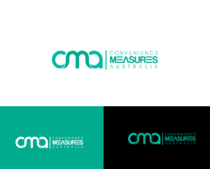
Logo Refresh/Update- Needs to be simplified and modernised. Made easier to read
CMA necesitaba un logo design y recibió 28 Atrevido, Moderno, Market Research and FMCG logo designs de 18 diseñadores
Diseños
Diseñadores
Presupuesto


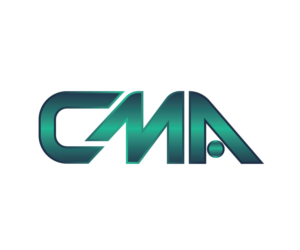

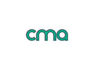


1 - 20 de 28 diseños de logo propuestas
Esto es lo que CMA buscaba en su logo design
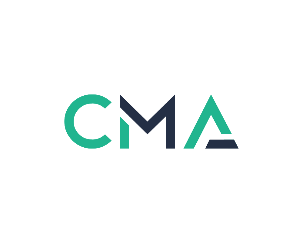
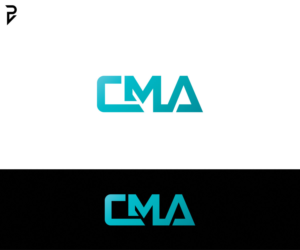
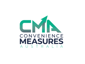
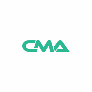
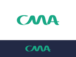
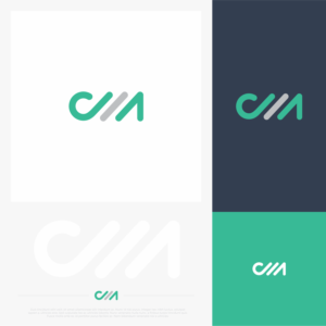
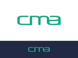
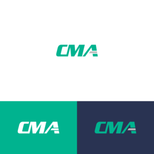
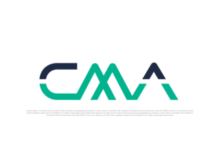
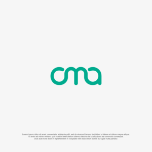
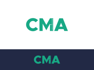
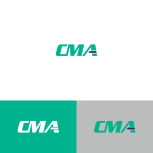
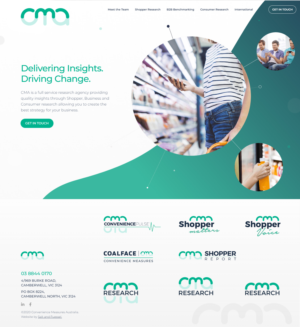
We need our current logo to be refreshed, but to be kept within the same themes and colours we currently use. Currently it has our full business name below it, however now we simply go by the name CMA not the Full Convenience Measures Australia name. We think that just dropping the words below is not enough as although we like the look of the CMA in the current logo, it alone is not clear and does not represent the brand.
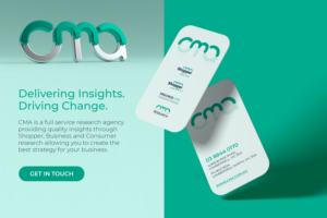
The images I have attached are our current full named versions. All of our company branding are in these colours, so we would like to keep it consistent.
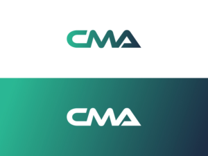
The new version needs to have the title CMA only (remove Convenience Measures Australia) but needs to be easy to read and recognisable at a glance. Our company colours are:
Green : Pantone 339 C=73% M=0 Y = 56% K =0
Blue: Pantone 533 C=90% M=75% Y = 45% K = 49%
Grey: Pantone Cool Grey 4C C = 0 M = 0 Y = 0 K = 30%
The font needs to be improved and keeping in with a modern fresh lo…
Leer más